Super Productivity Bundle
 Trestle Trotter


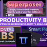

Super Productivity Bundle
Complete Documentation
Each add-on documentation can be found down below
You can also find their individual documentation in each add-on's product page
Horizontal Tabs
User guide and reference documentation for the Horizontal Tabs Blender add-on.
Overview
Horizontal Tabs is a Blender add-on that lets you place organized tab-based controls directly in editor headers. Instead of depending only on the default sidebar, also known as the N-panel, you can open tools from compact header tabs and popovers.
This approach helps keep more of the viewport visible while still giving you quick access to commonly used tools. It is especially useful for artists and technical users who want a cleaner workspace, faster access to panels, and different interface layouts for different tasks.
Presets
Presets are named collections of tabs assigned to specific editor types. You can create different presets for modeling, rigging, shading, animation, or any other workflow, then switch between them when your workspace changes.
Dynamic Tabs
Tabs can contain panels, operators, labels, and separators. This gives you a flexible way to build a header layout that matches the tools you use most often, without forcing everything into a single long sidebar.
Custom Strips
Custom strips allow you to create dedicated interface rows by splitting Blender areas. This is helpful when you want always-visible tool access without giving up too much room in the main editor.
Installation Guide
Important note for users upgrading from an older version
Horizontal Tabs 2.0 and later are not backward compatible with earlier releases. If you already have an older version installed, remove it first before installing the new version. This helps prevent registration conflicts, outdated settings, and other avoidable issues.
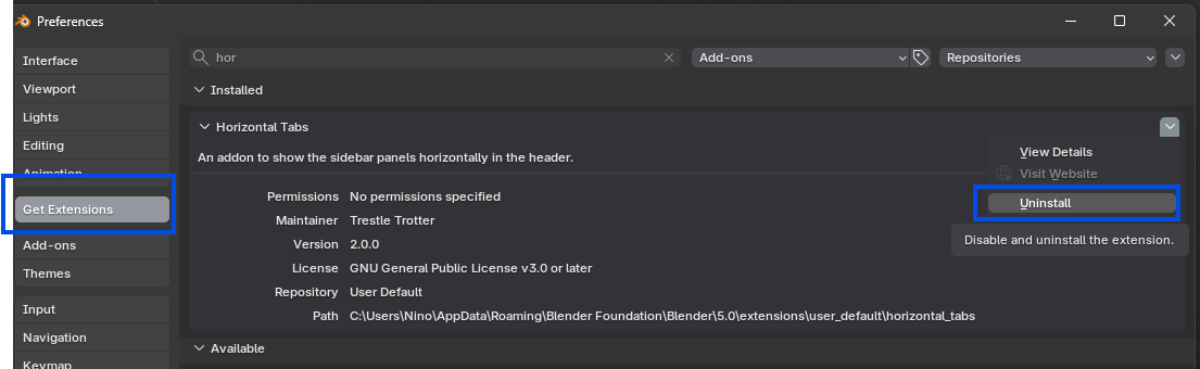
Clean installation steps
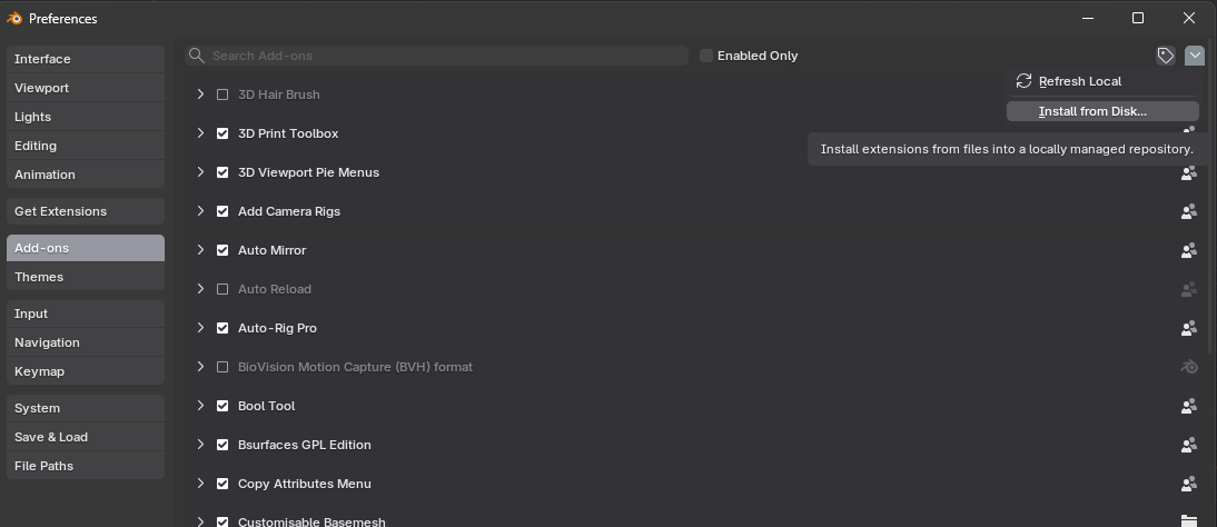
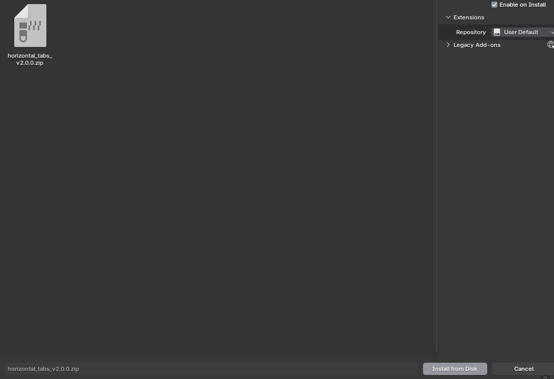
Open Edit -> Preferences -> Add-ons, then open the options menu and choose Install from Disk.... Select the downloaded ZIP file for Horizontal Tabs and confirm the installation. Once Blender finishes installing the add-on, enable it in the add-ons list.
If the add-on does not appear immediately, use the search field in the Add-ons tab and search for Horizontal Tabs. After enabling it, the preferences panel for the add-on will become available so you can start creating presets.
Setting Up Docks
Preset management
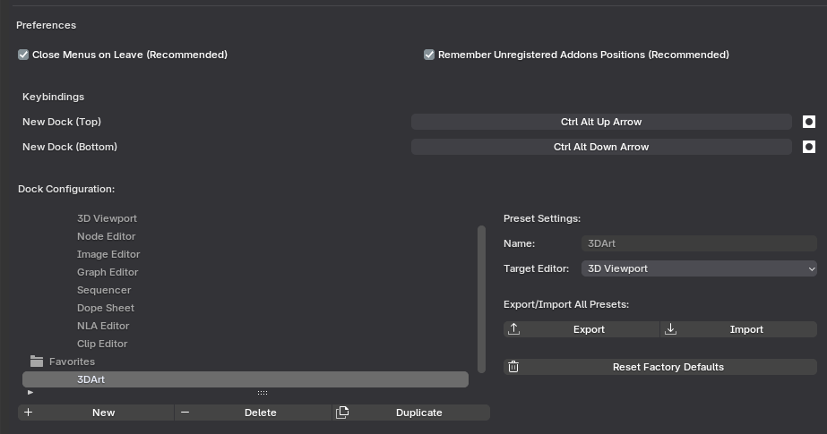
Create and manage presets in Preferences -> Add-ons -> Horizontal Tabs. From this panel, you can add new preset collections, duplicate existing setups, rename items, and control which tabs appear in each editor type.
This is the main control center for organizing your interface. A good workflow is to start with one base preset, duplicate it, and then tailor each copy for a specific task so you do not have to rebuild your layout from scratch every time.
Dock item customization
Each dock item can be adjusted to fit the way you work. You can rename items, choose how they behave, and fine-tune how much space their content uses when opened in a popover.
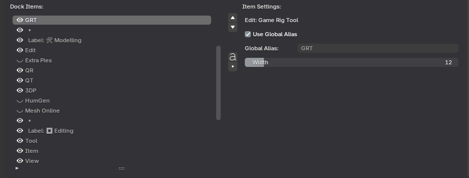
Global Alias: Use this when you want the same panel name to stay synchronized across all presets. Disable it if you want the same tool to have a different label in one specific preset.
Width: Adjust the popover width for panels that need more horizontal space. The default value works for most cases, but some add-ons and custom tools are easier to read when given a wider layout.
Additional widgets
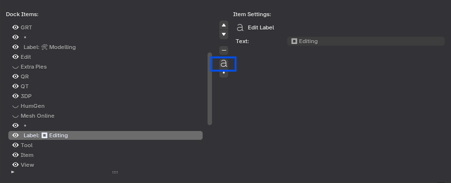
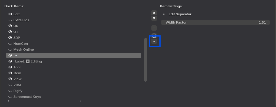
Labels and separators help you structure large tab groups so they remain readable. Labels are useful for marking sections or tool categories, while separators add controlled spacing between related items.
These small elements are especially valuable in larger presets, because they make the interface easier to scan and reduce the feeling of clutter when many tools are shown in the same header.
Quick Shortcuts
Ctrl+Alt+Up Attach a new dock to the top of the current area. This is useful when you want quick access to a custom strip without changing your main editor layout too much.
Ctrl+Alt+Down Attach a new dock to the bottom of the current area. This option works well when the top header is already busy and you want a separate strip for supporting tools.
Manual Editor Selection
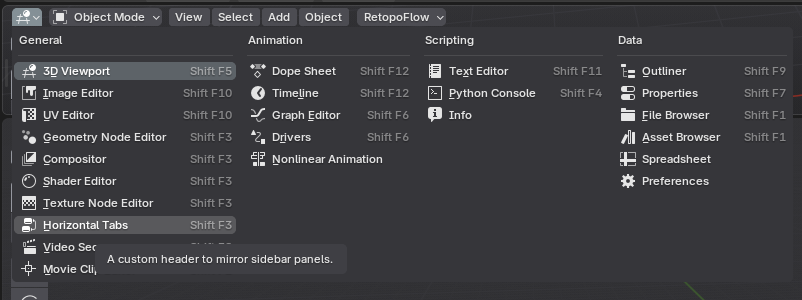
You can also convert a Blender area into a Horizontal Tabs header manually through the native Editor Type menu. Open the editor selector for the area and choose Horizontal Tabs from the available editor types.
This method is helpful when you want direct control over where the add-on appears, or when you are building a custom workspace layout and want to assign Horizontal Tabs to a specific area by hand.
Workflow and Workspace
Workspace persistence
Horizontal Tabs remembers the selected preset for each workspace. This means you can keep one layout for modeling, another for animation, and another for look development without manually rebuilding your tool arrangement every time you switch contexts.
You can switch presets from the hamburger menu in native headers or from the dropdown menu in custom strips. This makes it easy to test different layouts until you find the arrangement that best supports your workflow.
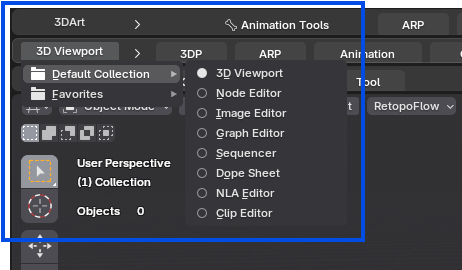
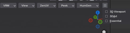
Note: In native tool headers, the old eye icon has been replaced with a reveal arrow. The new control is clearer and better matches the way hidden header content is accessed.
Multi-tier stacking
For more advanced production setups, you can stack multiple custom headers and assign a different preset to each one. This allows you to separate tool groups by purpose and keep complex workspaces easier to navigate.
This setup is especially useful when a single header is not enough for the number of tools you need available at once. Instead of creating one crowded strip, you can divide tools into cleaner layers such as modeling, scene management, and utility actions.

Smart Pie Menus
Documentation
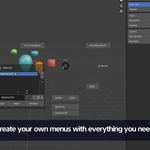
Blender Addon to create smart, context-aware, and highly customizable pie menus to fit your workflow.
V1.4.3 Changes to Hotkey Editor
In Version 1.4.3 it is required to hit Register Menus to save the hotkey changes from your pie menus, maybe this will change in a future version.
Tutorial Video
Installation
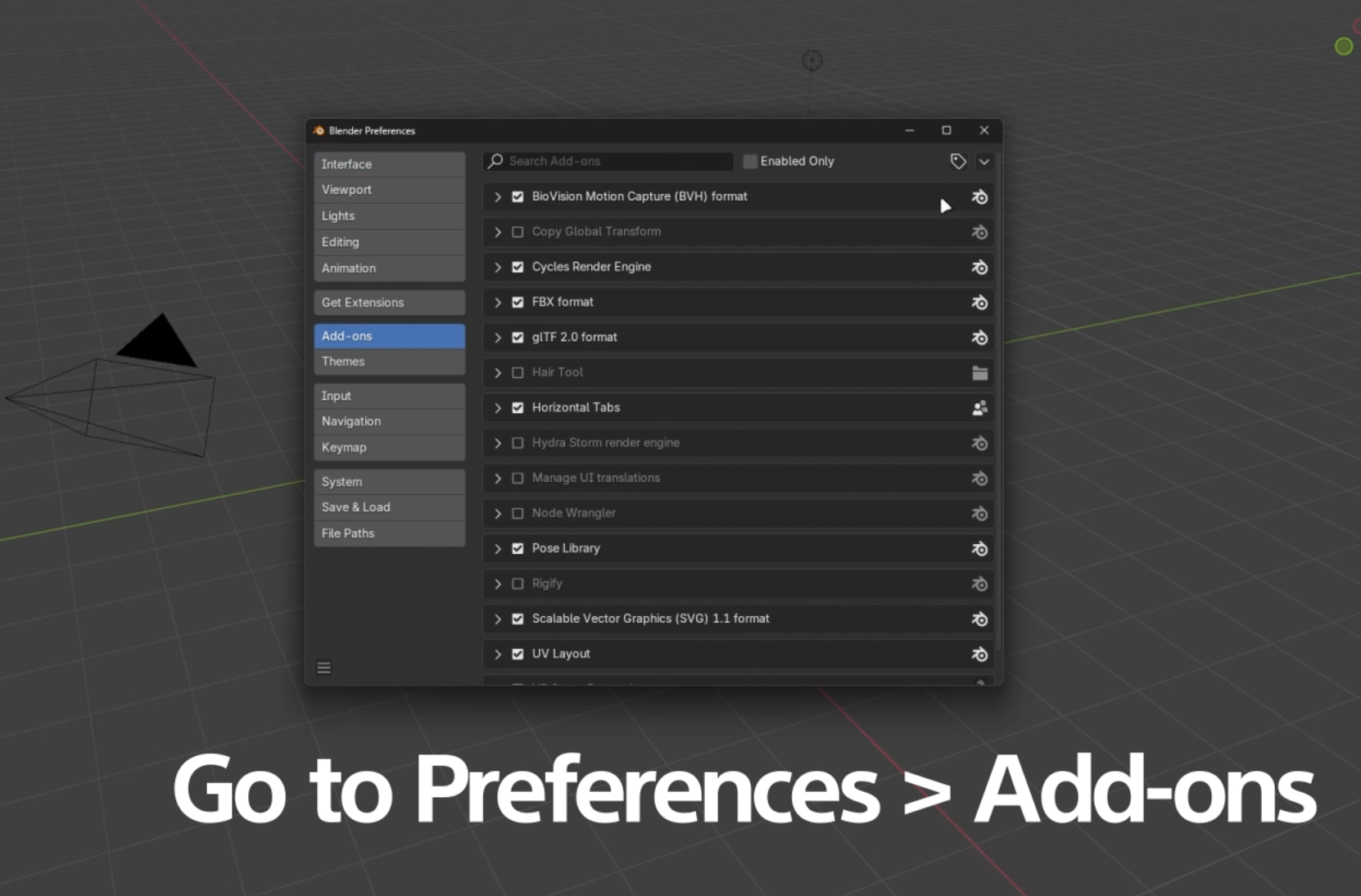
1. Open Blender Preferences
Go to Edit > Preferences and navigate to the Add-ons section.
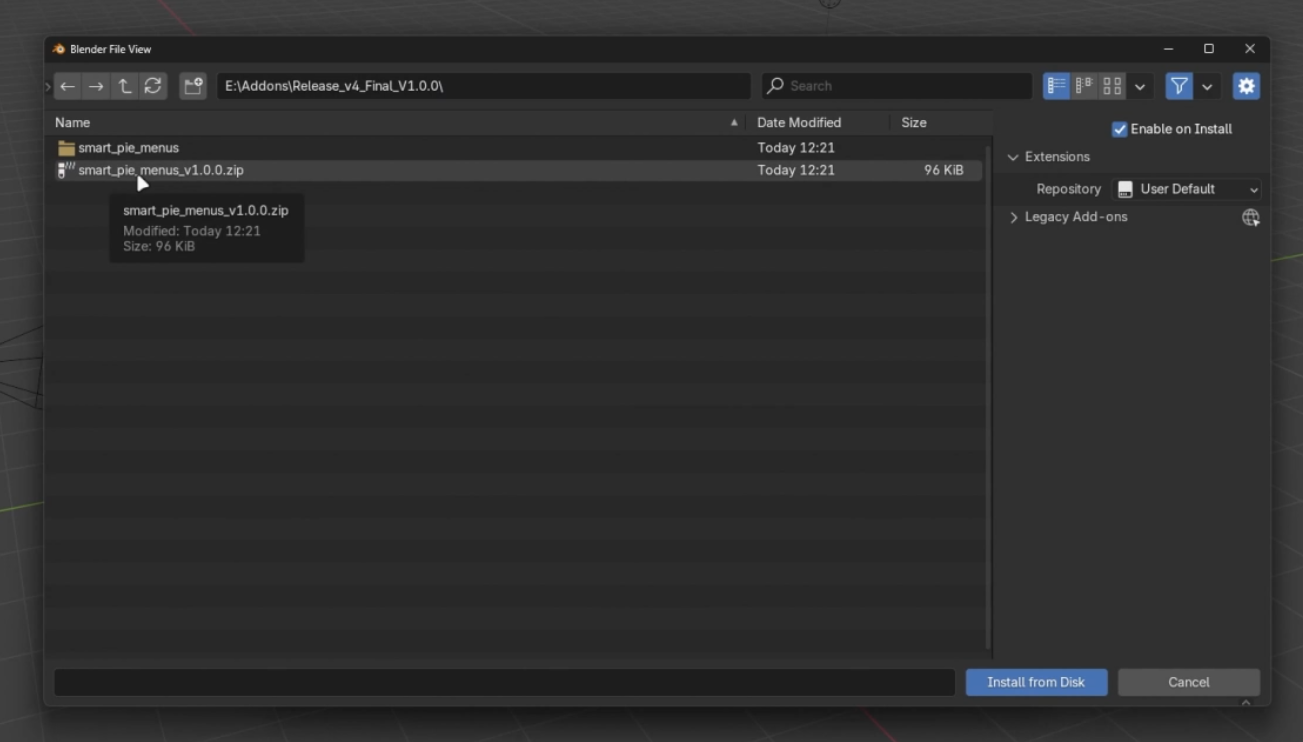
2. Install From Disk
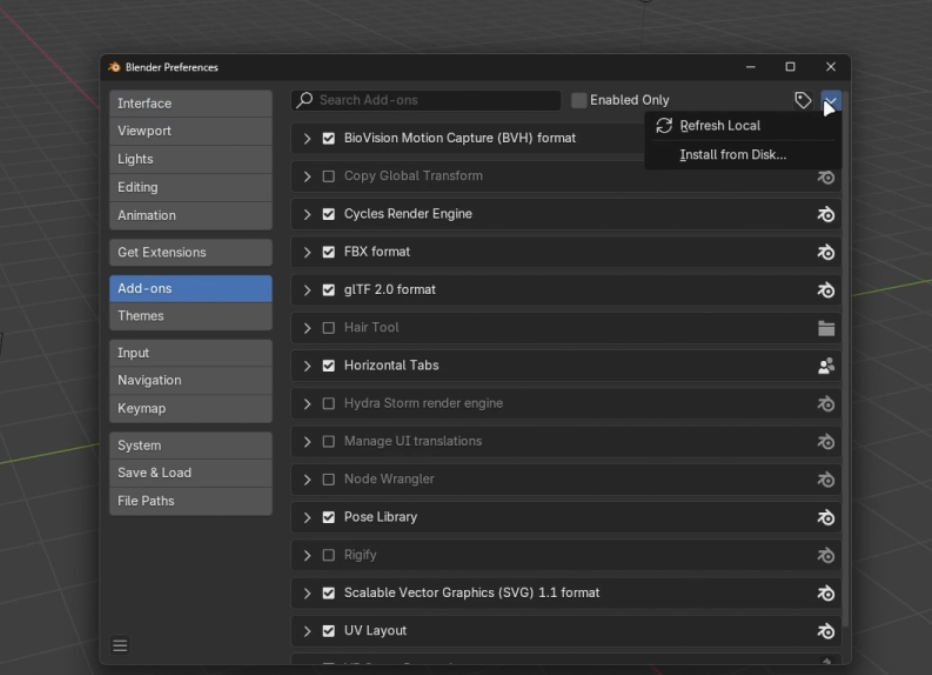
Click the drop-down arrow in the top right and select "Install from disk...".
3. Locate and Enable the Addon
Find the downloaded `.zip` file for Smart Pie Menus and click "Install from Disk". Then, make sure to check the box to enable it.
New Features V1.4.0
Version 1.4 focuses on faster setup, more reliable hotkeys, and smarter context-aware actions when working across Blender modes.
1. Premade Action: Rescan Blender UI
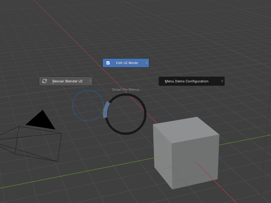
A new premade Rescan Blender UI action refreshes Smart Pie's discovered menus, panels, operators, UILists, brushes, and Horizontal Tabs without restarting Blender or reloading the addon.
This is especially useful after enabling another addon, because newly loaded interface elements can become available for Smart Pie capture immediately.
2. Hotkey System Improvements
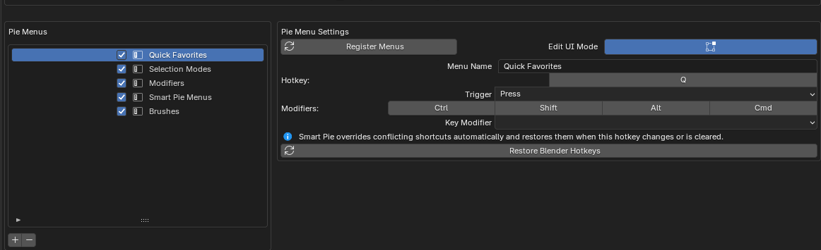
Hotkey handling is now more robust. Smart Pie keeps track of each menu's assigned shortcut, and helps avoid duplicate assignments between menus.
When a Smart Pie shortcut conflicts with Blender defaults, the addon can override conflicting shortcuts automatically and restore them again when the Smart Pie hotkey is changed or cleared.
Important: To correctly change the hotkeys use "Restore Blender Hotkeys" which will unbind the smart pie menu hotkey from all blender native actions manually.
3. Context Properties: Toggle To Mode
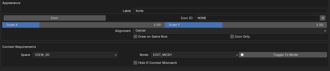
Actions can now switch to the required object mode before they run. In Context Requirements, enable Toggle To Mode on the base mode or on an additional allowed context entry.
This makes it much easier to build actions that need a specific mode first, such as jumping to Object Mode before executing a command captured from the Properties editor.
4. New Premade Brushes Action Type
A new Menu Items Configuration action to add brushes from the editor is now available. Select a brush or add it with the edit ui mode context menu.
The brush actions have "Toggle To Mode" Sculpt automatically selected.
Basic Usage: Getting Started
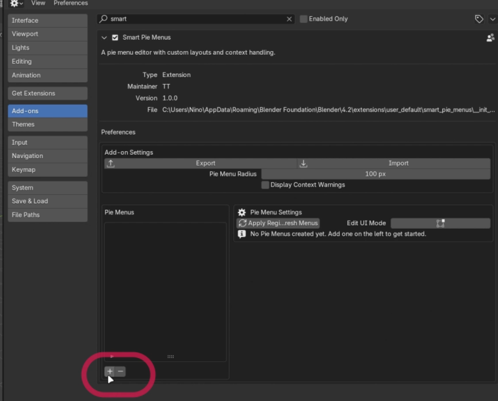
1. Create a New Pie Menu
Click the '+' button below the Pie Menus list inside the Smart Pie Menus panel to create your first menu.
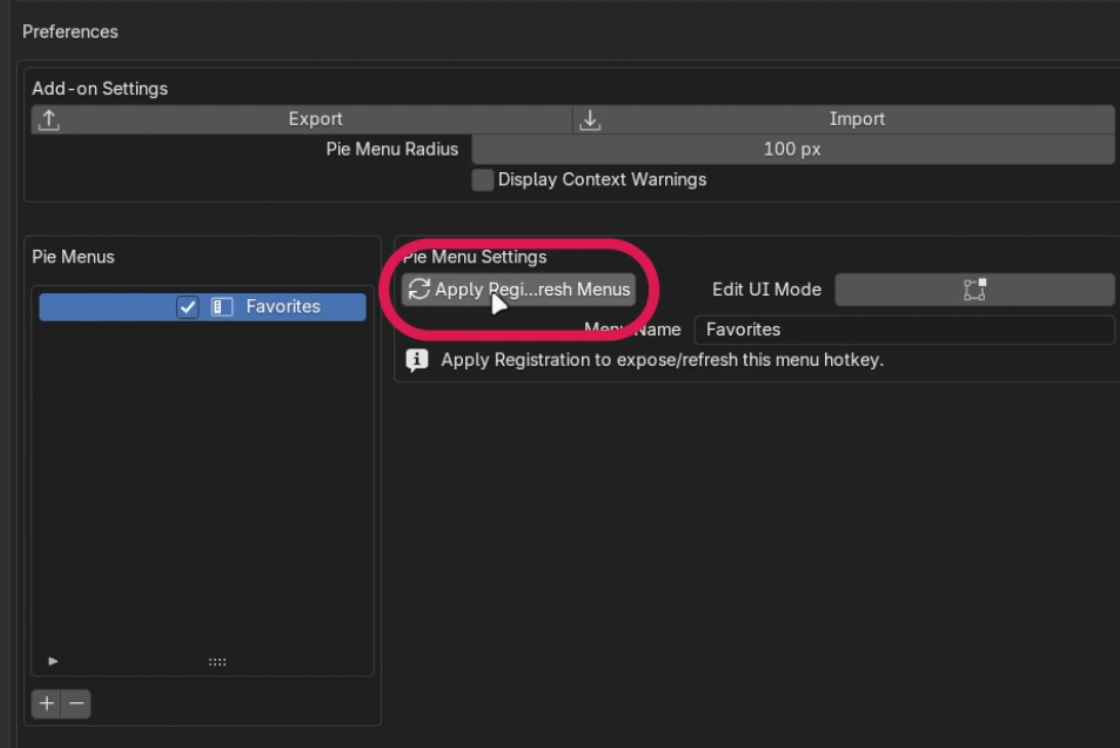
2. Name and Register
Give your new menu a custom name and click "Apply/Register Menu". Then click the refresh button to update the available menus.
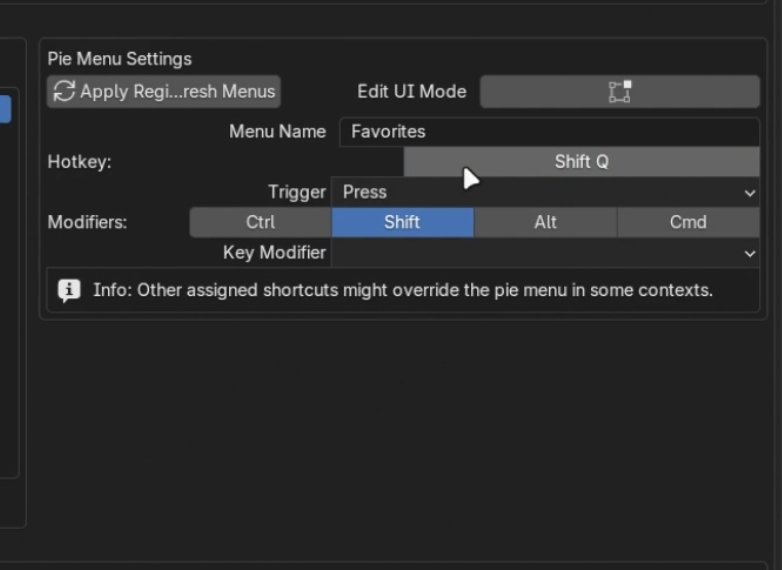
3. Set a Hotkey
Bind your pie menu to a hotkey so you can quickly access it anywhere in the viewport.
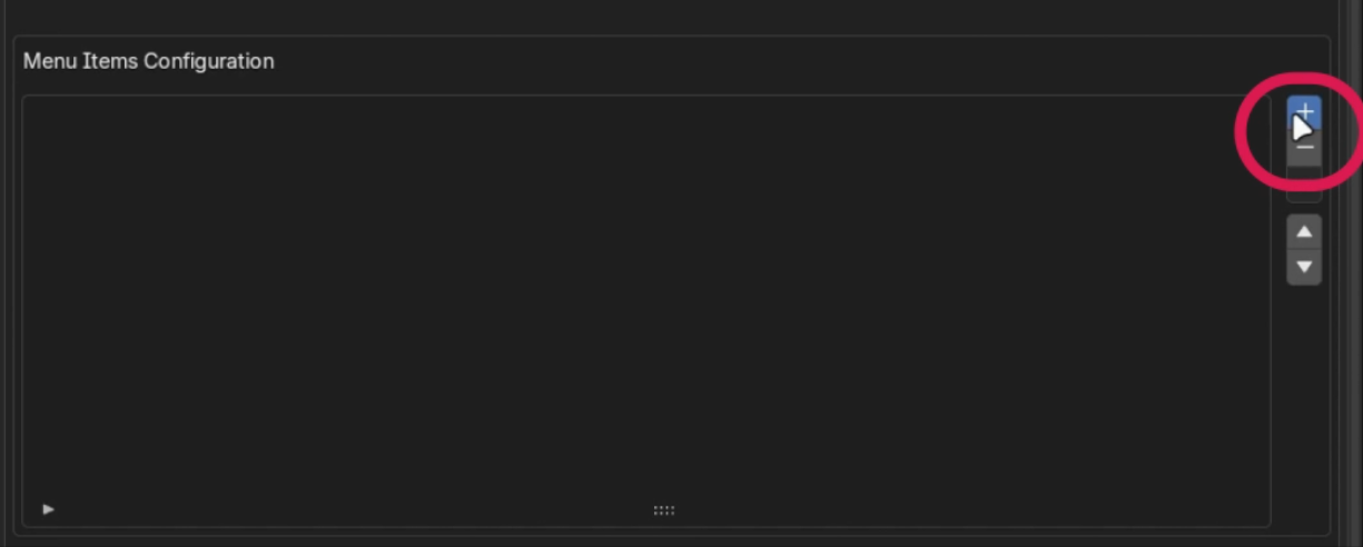
4. Add an Item
Click the '+' button next to the Menu Items list to create a new slot in your pie menu.
5. Configure Item Action
Name the action and select its type using the Item Settings menu. You can choose whether it works as a standard operator, a UI element, or more.
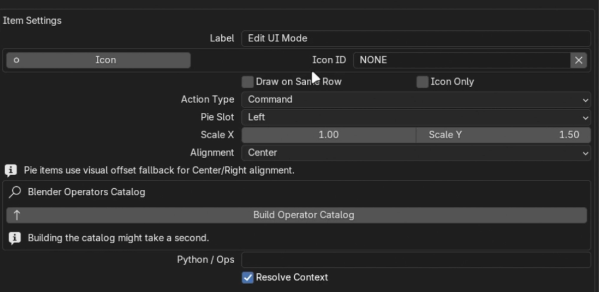
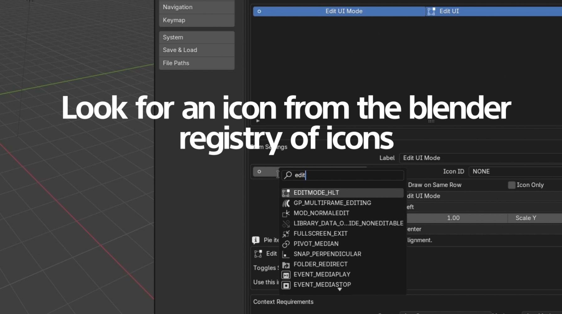
6. Set Custom Icons
Use the icon dropdown selector to give your custom action an easily identifiable visual.
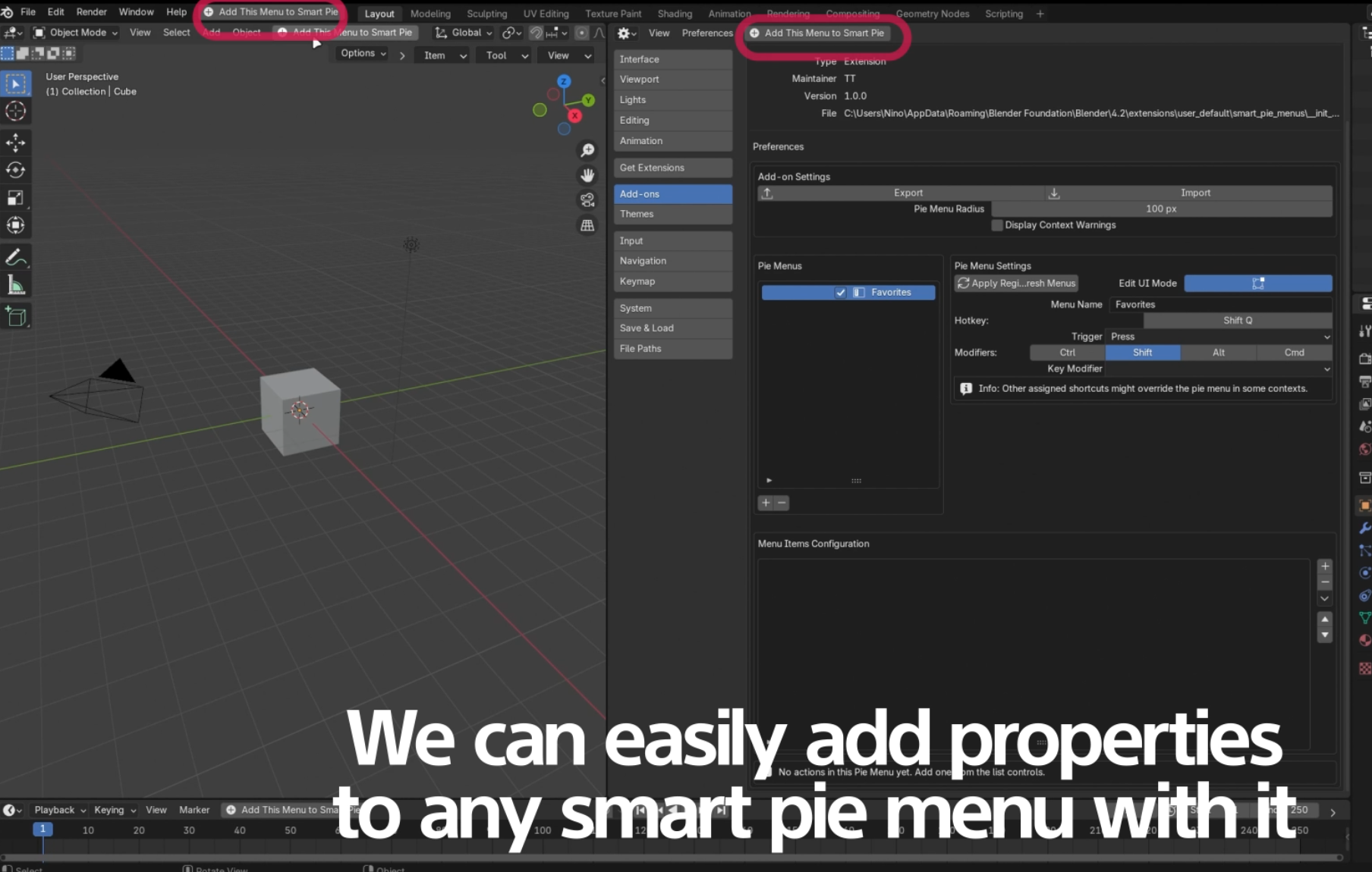
Easily Adding Items
1. Enable Edit UI Mode
Turn on 'Global UI Edit Mode' to enable the easy addition of interface items straight into your list.
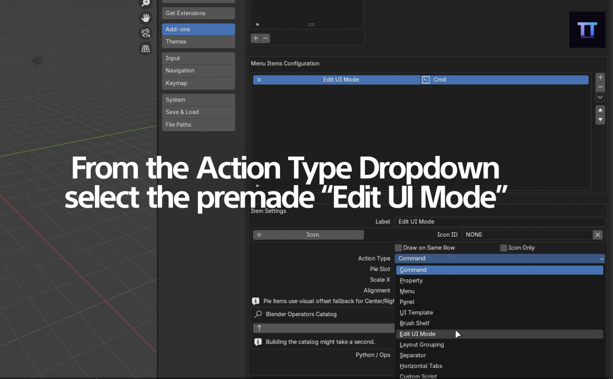
2. Add Recommended Actions
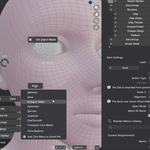
Once active, you can easily use pre-made action types and the highly recommended "Add to Pie Menu" option via the right-click context menu.
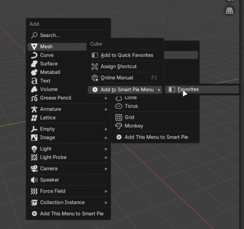
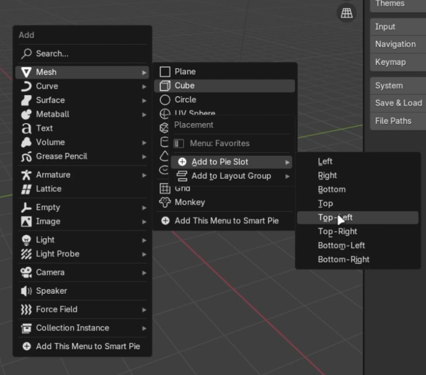
3. Context Menu Capture Flow
Here is the full flow of capturing an item via Right-Click:
Right click on any operator or property.
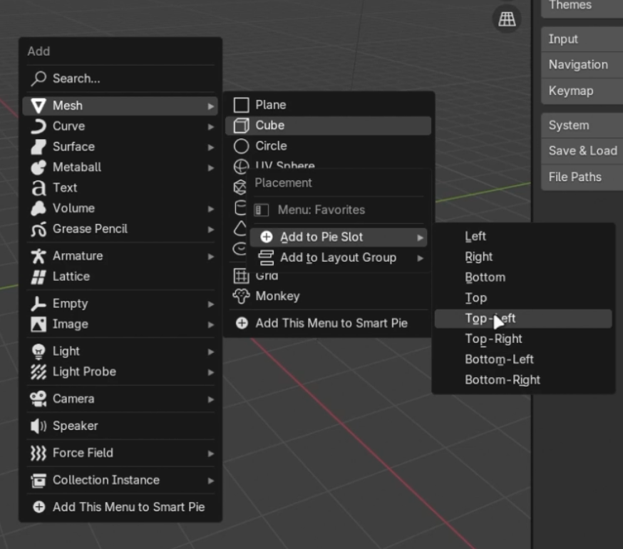
Choose the Pie Direction Slot (e.g., Top, Left, Bottom).
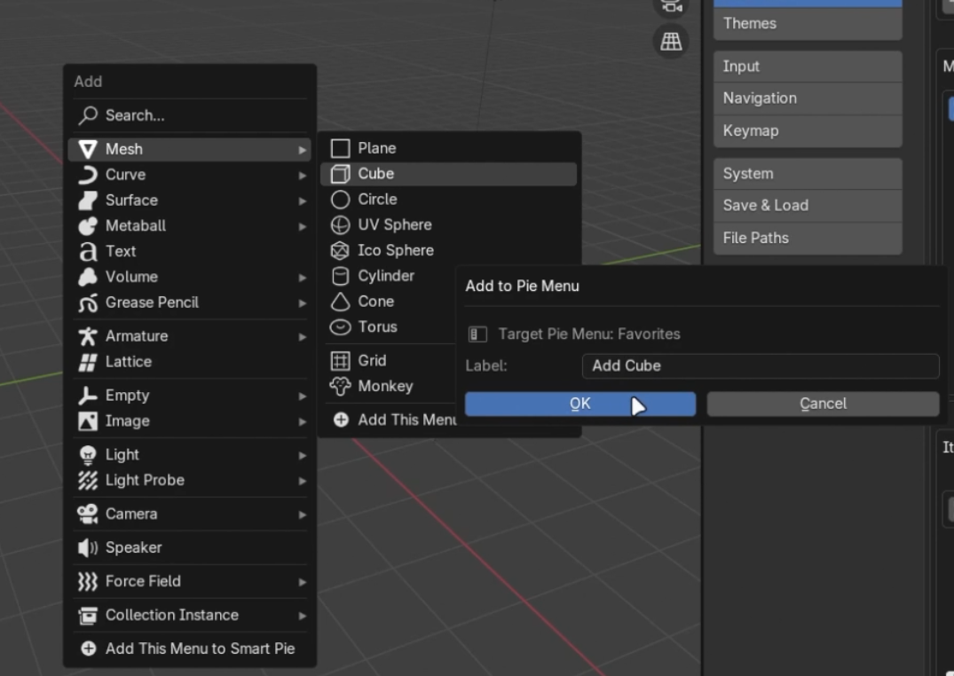
Provide a custom label for the entry.
Action Open Modes
When creating complex actions like nested menus or popovers, Smart Pie Menus provides several "Open Modes" to control how these elements are displayed to the user.
1. Click Popup
This mode requires the user to click the item, which then opens a floating popup containing its content. It's ideal for keeping the initial pie menu clean while offering extended options on demand.
2. Click Panel Popover
Similar to Click Popup, but it opens a Blender Panel-style popover instead. This seamlessly integrates with Blender's native UI feel and is great for grouping properties.
3. Hover
Hover mode allows the sub-menu or layout to open automatically when the user places their mouse over the item, without requiring a click. This enables a rapid, fluid workflow.
4. Nested Pie
This mode treats the action as a gateway to another completely separate Pie Menu. When activated, the current pie menu closes, and the new nested pie opens at the cursor location.
Layout Groups
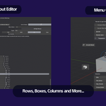
Layout elements allow you to create complex column, row, and box structures inside your pie slices instead of just single buttons.
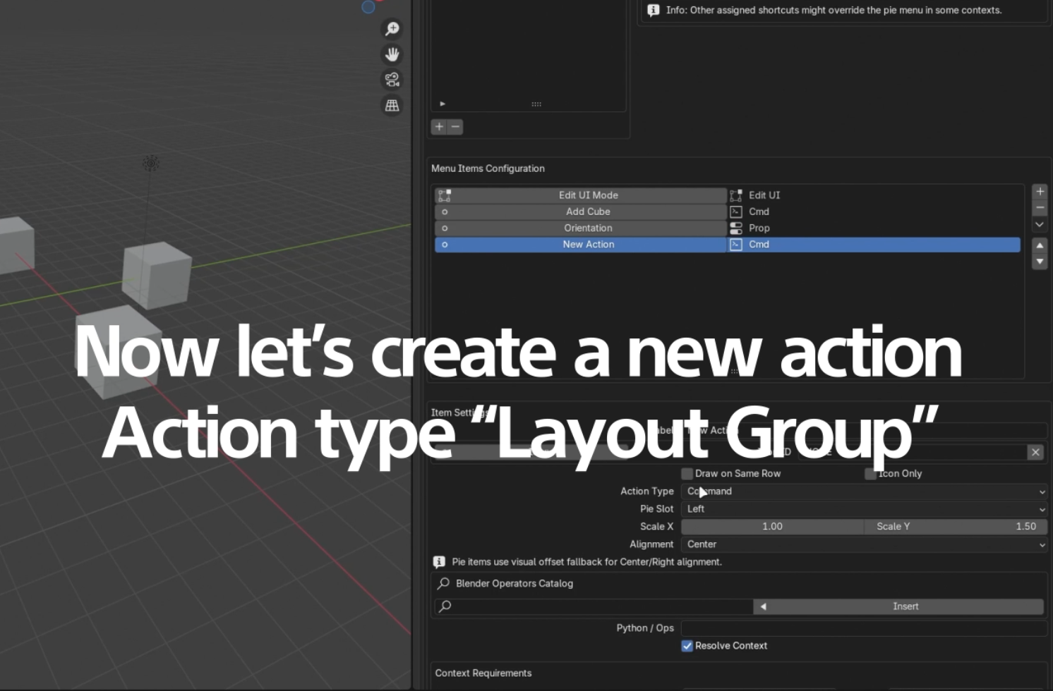
1. Selecting the Action Type
To create a layout group, simply change an item's Action Type to a Layout Type (e.g., Row, Column, Box, Panel).
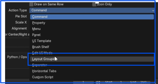
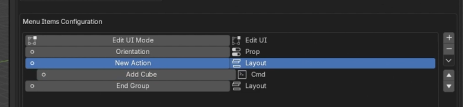
2. Automatic End Groups
When you create a Layout Group starting node, the addon automatically adds an 'End Group' item to close the structural block.
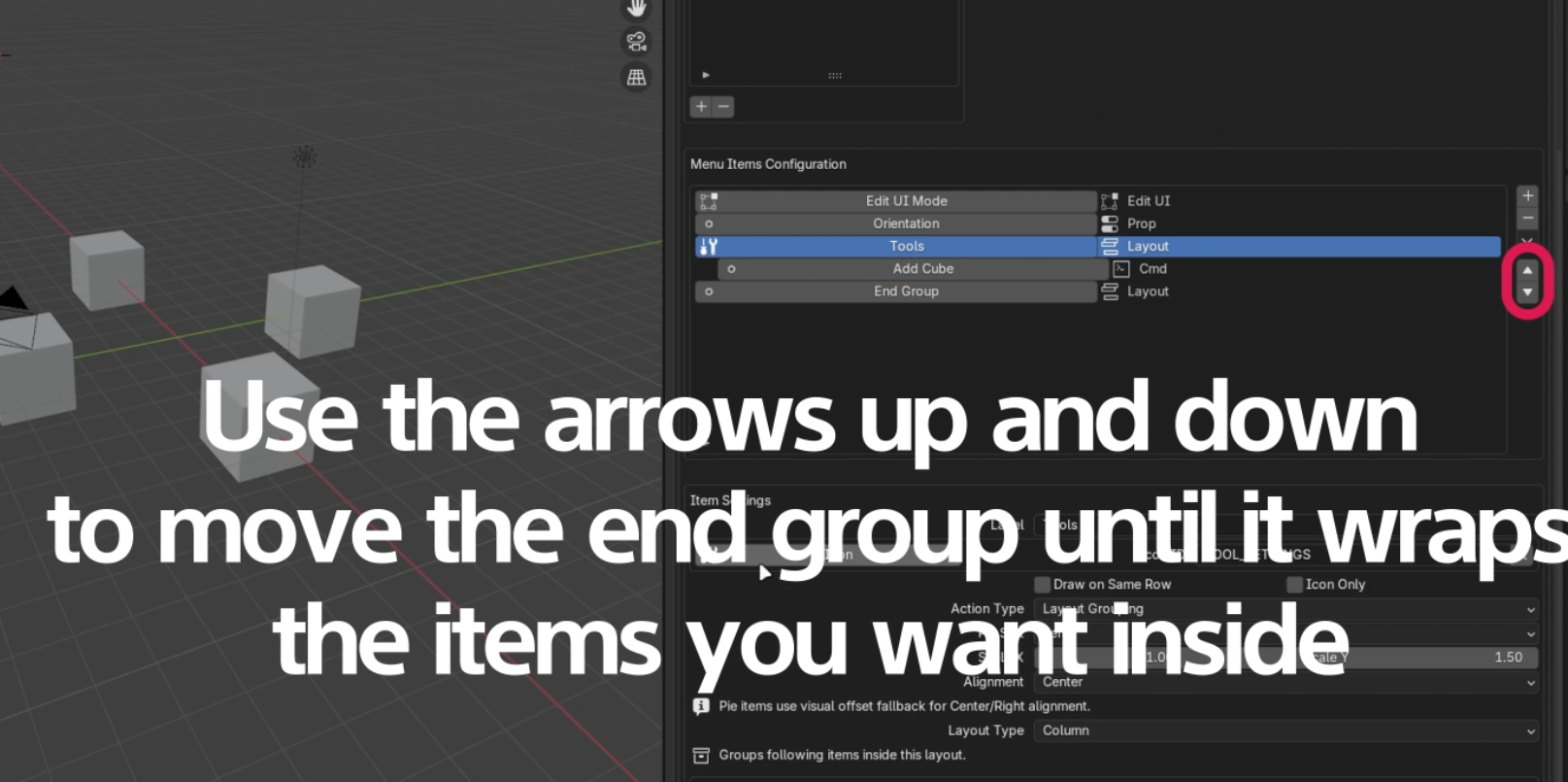
3. Wrap Items Between Layout Nodes
Move your actionable items between the start and end layout group nodes to encapsulate them within that UI structure.
4. Add Contextually
When selecting a Layout Group node, items added via the Context Menu are intelligently placed inside that group automatically.
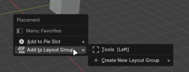
5. Exploring Group Types: Box and Nested Groups
Boxes add a nice background shading. You can even nest layout groups inside other layout groups to build very intricate interfaces!
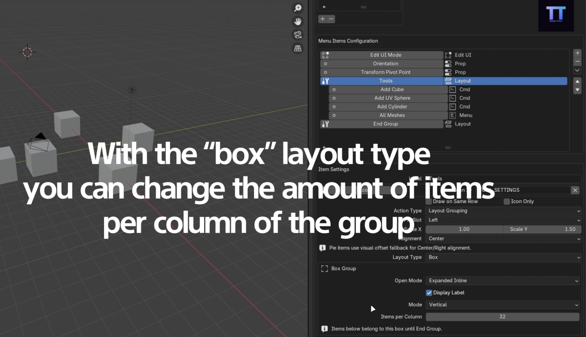
The Box Layout Group in action.
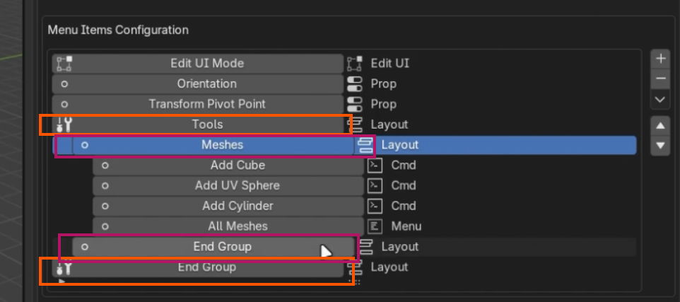
Nesting rows inside a column, or vice-versa.
Layout Orientation
When organizing elements within Layout Groups, you have full control over the direction in which items flow depending on your design needs.
1. Vertical Mode (Columns)
Setting your layout to vertical mode stacks items strictly from top to bottom. This is ideal for list-like properties, large buttons, or sequential options that need to be read downwards.
2. Horizontal Mode (Rows)
Horizontal mode aligns items side-by-side from left to right. Use this orientation to group multiple small icons, color swatches, or toggle buttons tightly together on a single line to save vertical space.
Context Requirements
Make your menus "Smart" by deciding exactly when and where they show up based on Blender's current state.
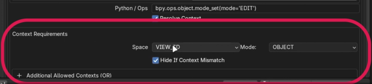
1. Choose Space and Mode
Define which editor workspace (e.g., 3D Viewport) and what object mode (e.g., Edit Mode, Object Mode) must be active for this item to appear.
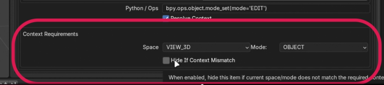
2. Hide Mismatched Items
Turn on 'Hide if Context Mismatch' so the button completely disappears when circumstances aren't met, keeping your pie menus clean rather than graying them out.
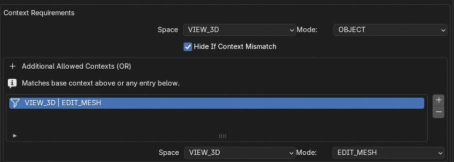
3. Additional Contexts
Add additional contexts in which you want to see the pie menus. You can always choose Space (The space the action belongs to, and object mode; Edit, Sculpt, etc.)
Advanced: UI Templates
For rendering complex interface elements like lists or unique native layouts directly inside your pie menus.
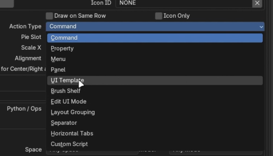
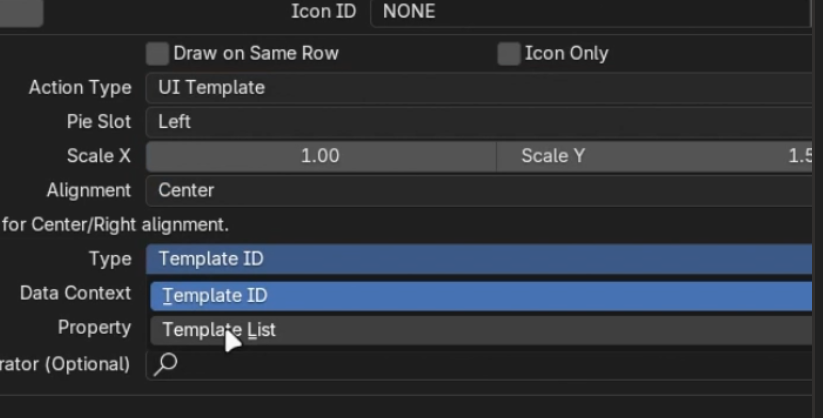
1. Select UI Template Action
Change your action type to 'UI Template'.
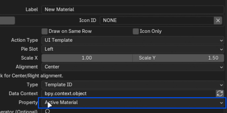
2. Expose Active Material/Properties
By defining the template property targets, you can elegantly expose things like the 'Active Material' selector.
3. Template Lists
Need a full scrollable material slot list? Set the Template Type to `TemplateList`, then specify catalog references and data paths (e.g., Material Slots).
Importing & Exporting
Smart Pie Menus allows you to easily share your custom tools with others or back them up securely using the built-in Import and Export functionality.
1. Exporting Menus
To back up a menu, navigate to the Smart Pie Menus panel and look for the Export button. This will package your pie menu's entire structure, including its items, context conditions, and layout groups, into a single file.
2. Importing Menus
To bring in a menu created by someone else, simply click the Import button and select the corresponding file from your disk. The addon will automatically register the new pie menu, complete with all its configured items and shortcuts. Included with the offline documentation is a test configuration file "smart_pie_config_example.json" you can import it to test some menus we made.
Superposer
Documentation
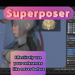
Reference overlays from files, clipboard sources, web images, GIFs, local videos, and video stream URLs, all managed directly inside Blender's 3D View.
What Superposer is for: Superposer keeps reference inside your viewport so you can import, position, scale, project, organize, save, and revisit visual material without constantly leaving Blender. This guide focuses on the actual controls exposed by the addon panels and operators.
Installation
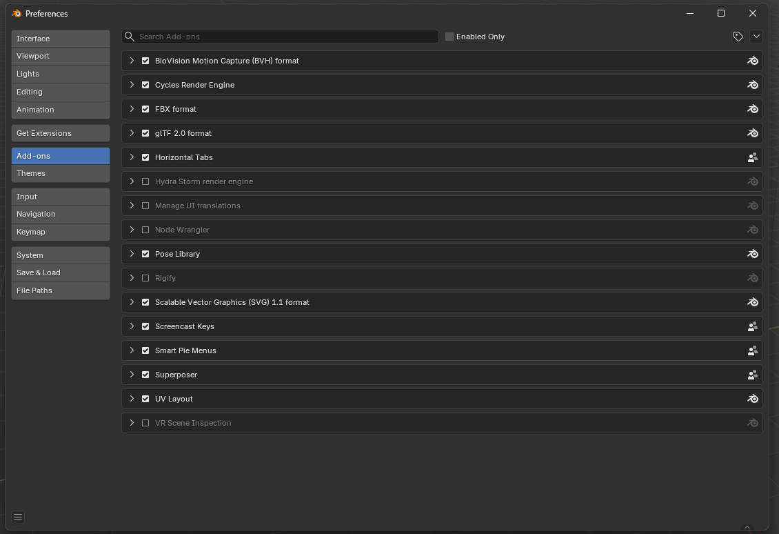
1. Open Blender Preferences
Go to Edit > Preferences and open the Add-ons section.
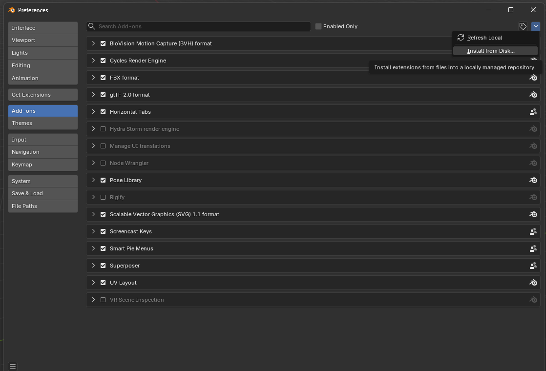
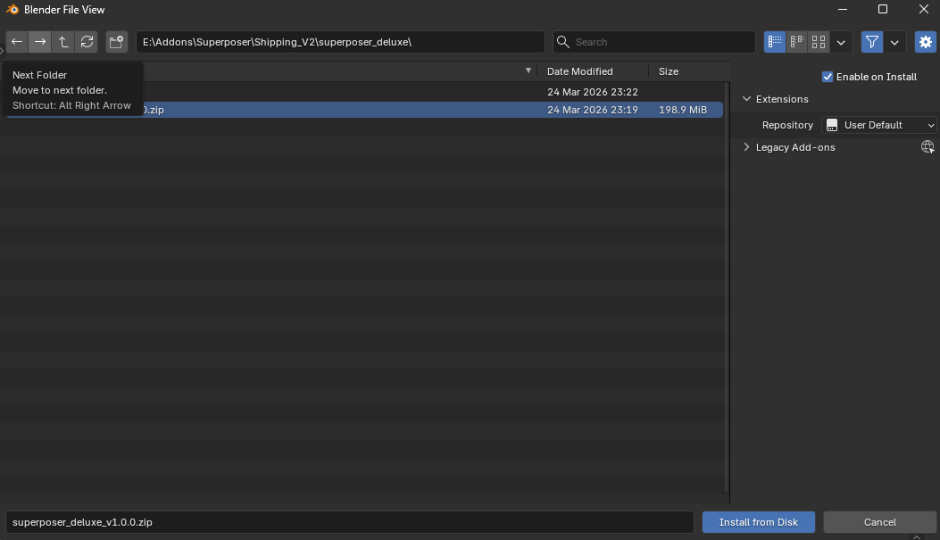
2. Install From Disk
Open the add-on menu in the top-right corner and choose Install from Disk....
3. Locate the Addon Zip
Browse to the downloaded Superposer version on your machine.
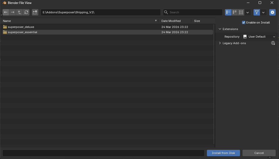
4. Install and Enable
Select the `.zip`, confirm the installation, and then enable the add-on. After that you will find Superposer in View3D > Sidebar > Superposer.
Quick Start
- Open the Import section and add a reference from a file, the clipboard, a web image URL, or a video stream URL.
- Use the Items list to choose the active reference and the Inspector to edit its properties.
- Keep it as a 2D overlay, project it from the current view, or convert it into an addon-driven plane when the reference should live in 3D space.
- Save your setup as a Board if you want to come back to the same collection of references later.
Import Operators
Superposer has multiple ways to bring media into the current board. All imported items are placed in the active 3D View and become editable immediately.

Add from File
Opens Blender's file browser and imports supported local files. This includes regular images, animated GIFs, and supported local video files. Superposer can also accept drag and drop directly into the 3D View.

Add from Clipboard
Shortcut: Ctrl + Shift + V.
This operator is smart. It can import a copied image, a copied file path, a copied image URL, or even a copied video URL. If the clipboard contains a web URL that is not a supported image, Superposer attempts to treat it as a video stream instead.

Web Image
Downloads an image from an HTTP or HTTPS URL and caches it locally for use inside Blender. This is the direct route for PNG, JPG, GIF, WebP, and similar image sources.

Video Stream URL
Resolves a remote video source without downloading the whole video as a normal file first. This is the intended path for supported web video pages and direct stream URLs such as YouTube-style links, direct MP4/WebM links, and other stream-compatible URLs.

Clipboard Monitor OFF
The automatic clipboard watcher is inactive. Superposer will not keep polling for newly copied sources.

Clipboard Monitor ON
When enabled, Superposer checks the clipboard regularly and imports newly copied supported sources automatically into the center of the active 3D View. This is very convenient during reference gathering, but it is a good idea to turn it off when you are done using it for better performance and fewer accidental imports.
Reference Modes
Each item can live in one of three main states. The icon shown beside the item in the list tells you which state it is currently using.

Overlay
A 2D viewport overlay. This is the most direct mode for arranging reference on top of your view. Overlay items use X, Y, Scale, and Rotation controls and support opacity, brightness, flipping, visibility, and locking.
Projected View
A 3D projection built from the current view. Superposer calculates a plane-like placement from what you were seeing in the viewport at that moment, then stores 3D Size, Location, and Rotation for the projected item. This is useful when the reference should feel anchored in space while still being managed as a Superposer item.

Superposer Plane
A real addon-driven plane object in the scene. Converting to plane creates an object that can live in your scene while still staying linked to the Superposer item. You can later send it Back to Project View or all the way Back to Overlay.
Viewport Controls and Shortcuts
Move
Drag with Left Click on an overlay item to move it in the viewport. Locked items cannot be moved this way. Projected items can still be made active, but a locked projected item will ignore the interaction.
Scale
Use the Mouse Wheel over an item to scale it up or down. Superposer scales around the cursor position so resizing feels more direct while you work.
Selection
Click an item in the Items list to make it active. Shift + Click in the list extends the selection, which is useful when deleting multiple items at once.
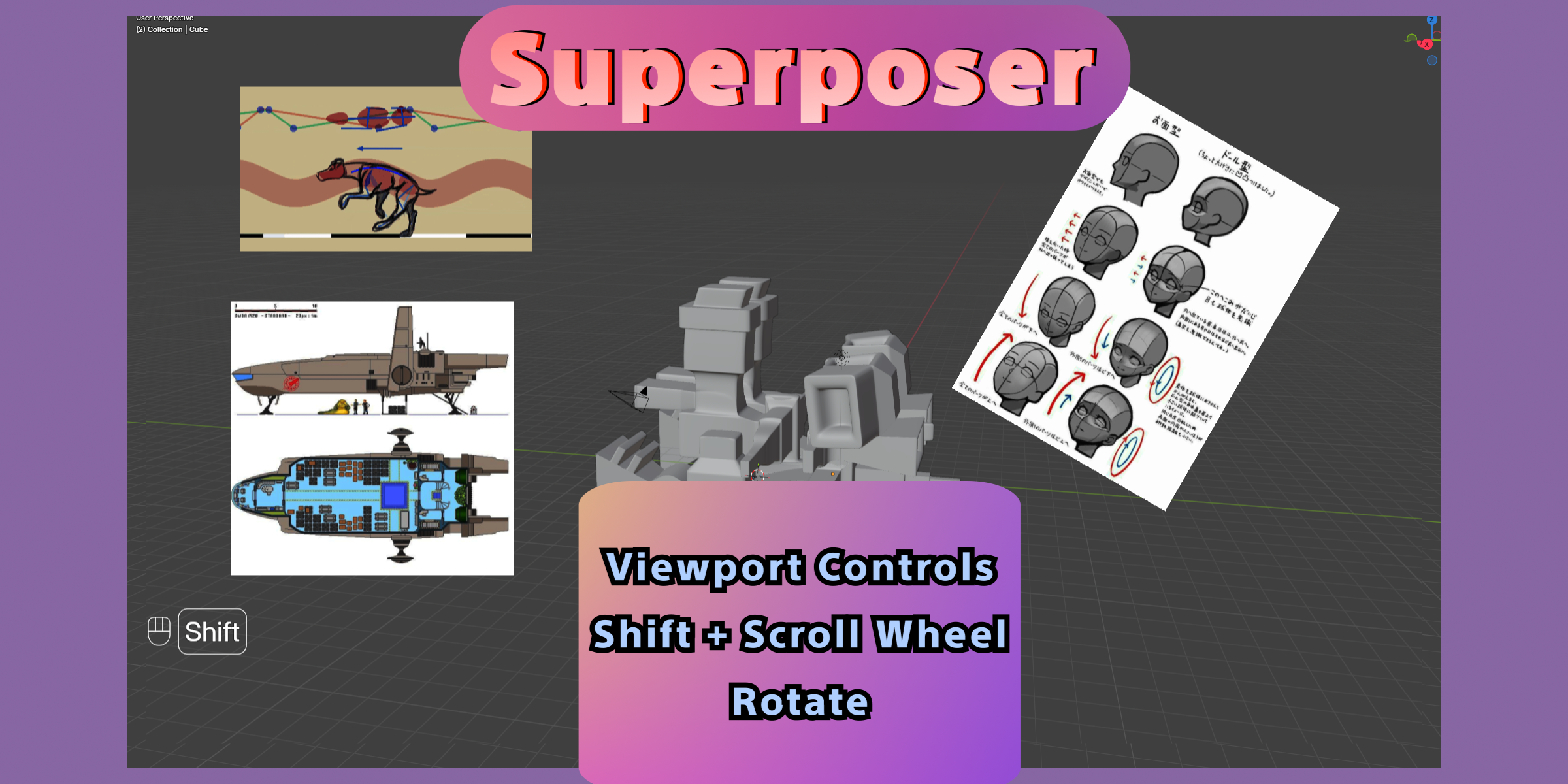
Rotation
Shortcut: Shift + Mouse Wheel. This rotates the hovered item in fixed angle steps.
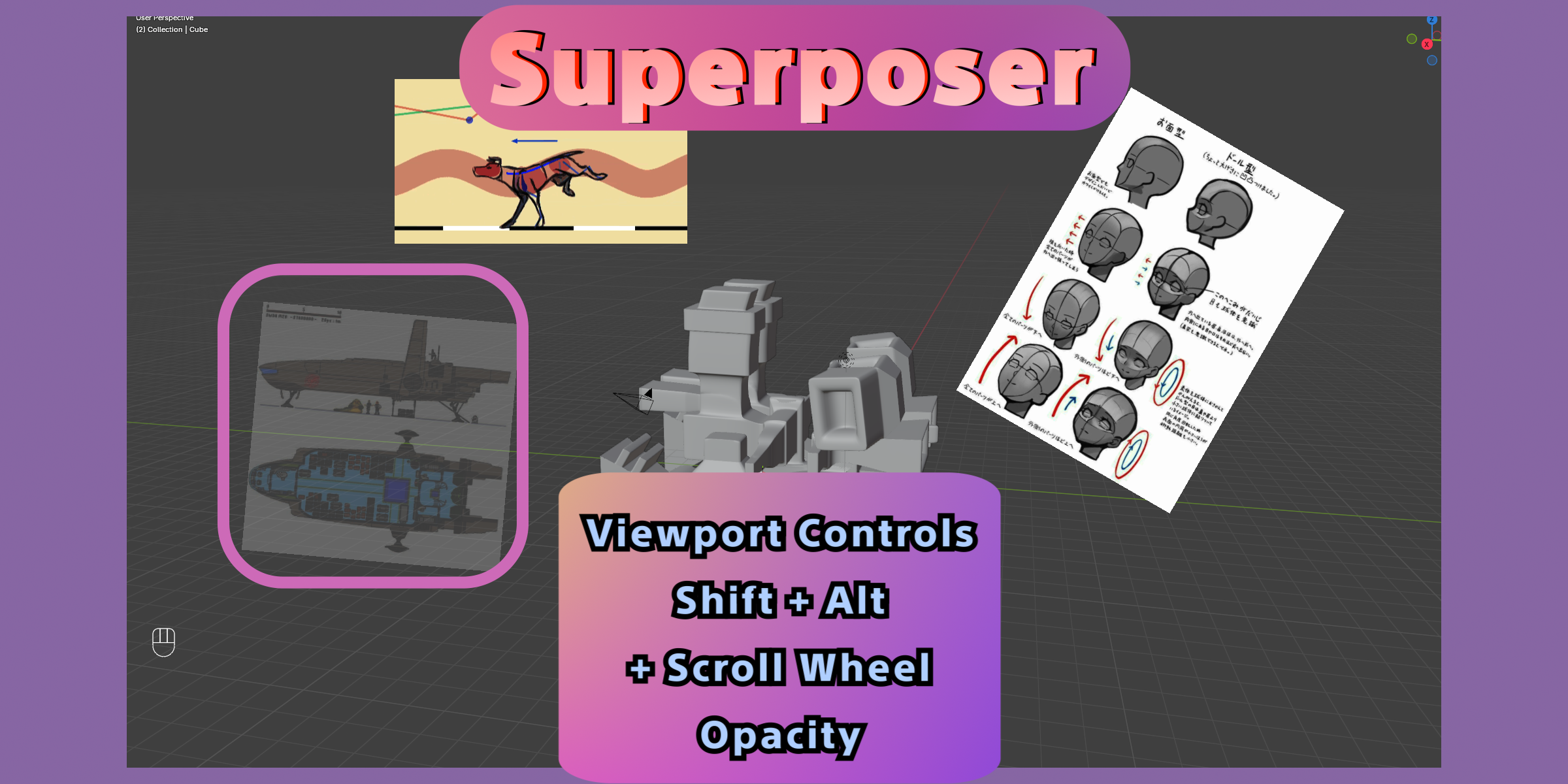
Opacity
Shortcut: Shift + Alt + Mouse Wheel. This adjusts the active item's opacity from 0% to 100%. Remember that final visible opacity is also affected by the global opacity setting in the Setup panel.
Brightness
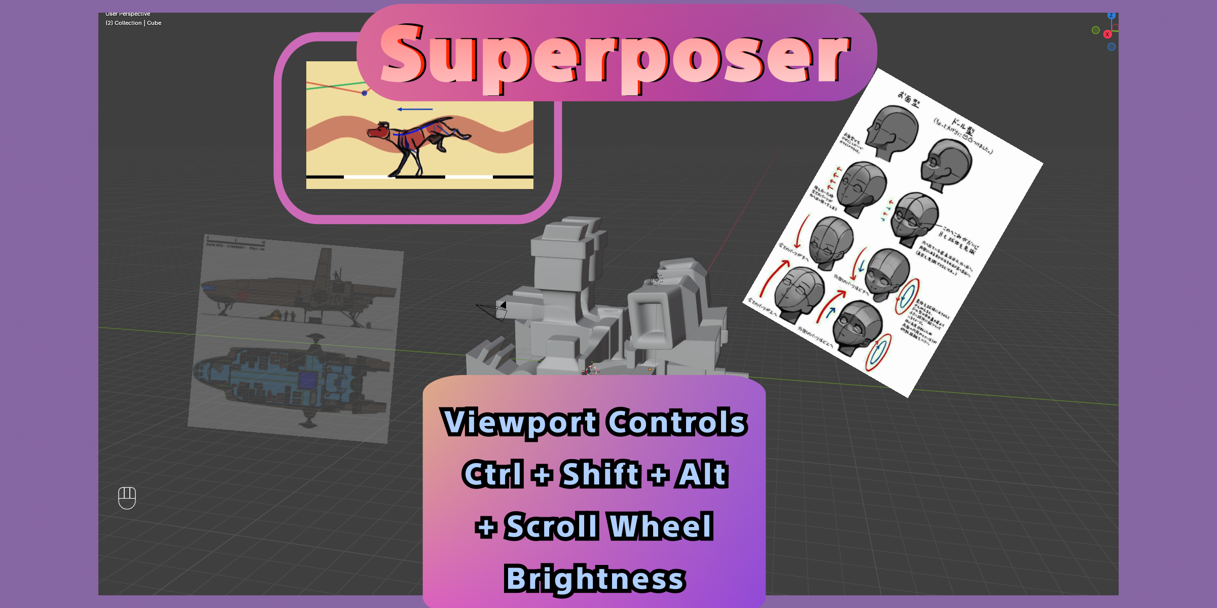
Shortcut: Ctrl + Shift + Alt + Mouse Wheel. This adjusts the brightness of the hovered item. The range is from 0.0 to 2.0, where 1.0 is the neutral default. This control is available for overlays and projected items, but not for addon planes.
Other Shortcut Details
- Double Click on a GIF or video item: toggles Play/Pause.
- Ctrl + Alt + Mouse Wheel: steps animated media frame-by-frame and pauses playback while you scrub. This works for GIFs and non-live video items.
- Alt + + or Alt + Numpad +: raises Deluxe audio volume for video items.
- Alt + - or Alt + Numpad -: lowers Deluxe audio volume for video items.
- X or Delete: removes the selected items, or the active item if nothing else is selected.
- Right Click in the 3D View context menu: exposes the Superposer menu for quick access to flipping, locking, projecting, plane conversion, playback actions, and deletion.
Panels
Setup Panel
The Setup panel contains the high-level behavior for the whole addon.
- Enabled: Master switch for Superposer drawing. When disabled, overlay drawing is turned off globally.
- Global Opacity: Multiplies the opacity of all visible references, including plane-driven opacity where relevant. This is useful when you want to fade the whole board without editing every item individually.
- Active Item on Hover: Makes the item under the cursor the active item automatically. Turning it off can improve performance and means Inspector edits apply after you explicitly click an item.
Boards Panel
Boards are saved collections of references. Each board has its own items, order, visibility state, and active item.
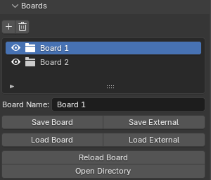
- Add / Remove Board: Creates a new board or deletes the current one.
- Board Name: Used both in the UI and when saving internally.
- Save Board: Saves the active board to Superposer's internal board directory as JSON.
- Save External: Writes the current board to a JSON file at a path you choose.
- Load Board: Loads an internally saved board and adds it back into the scene as a new board entry.
- Load External: Imports a board JSON from any path on disk.
- Reload Board: Refreshes the current board from its saved source file. This is useful if you edited the board JSON or want to re-open a stored version cleanly.
- Open Directory: Opens the internal boards directory in your file browser.
Items Panel
This panel shows every reference in the active board.
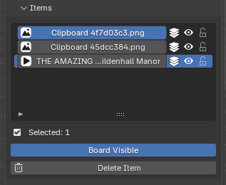
- Item Icon: Shows whether the media is an image, GIF, or video stream.
- State Icon: Shows Overlay, Projected View, or Superposer Plane state.
- Visible: Hides or shows that item.
- Locked: Prevents accidental viewport transforms like move, scale, and rotate.
- Selected Count: Shows how many items are currently selected for multi-item actions.
- Board Visible: Toggles the current board without disabling the addon globally. Use this when you want to hide one board but keep Superposer enabled.
Inspector / Item Panel
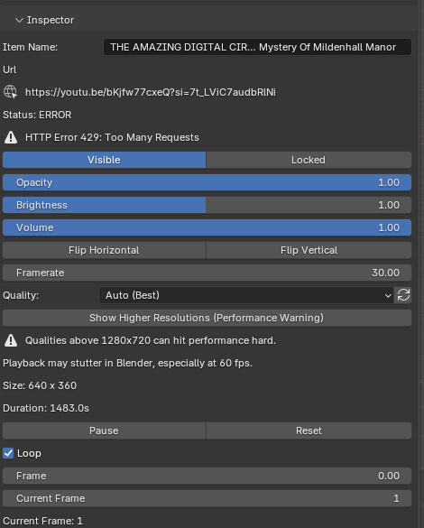
The Inspector is where most item-specific properties live.
General Item Properties
- Item Name: Custom display name for the reference in the item list and panel.
- Source Info: Non-file items display their source type, and URL-based items can show a shortened source URL. Video streams also show stream status and stream errors if there is a playback problem.
- Visible: Shows or hides the item.
- Locked: Prevents direct viewport transform edits.
- Opacity: Item-specific opacity from 0.0 to 1.0.
- Brightness: Adjusts display brightness from 0.0 to 2.0. Not shown for addon planes.
- Flip Horizontal / Flip Vertical: Mirrors the item visually without changing its source.
- Size Readout: Shows the current reference dimensions in pixels.
Animated Media Properties
- Framerate: Playback speed control for GIFs and videos. This is the speed Superposer uses for playback and frame stepping.
- Play / Pause: Starts or pauses GIF/video playback.
- Reset: Available for video items. Returns playback to the start.
- Loop: Controls whether playback repeats. Live streams cannot use looping.
- Frame Scrub: Slider for non-live video items. Lets you jump through the clip visually.
- Current Frame: Numeric frame input for non-live video items.
- Duration: Displayed for video items when that information is available.
- Live Stream: Shown when the source is live. Live streams do not expose frame scrubbing like regular clips.
Video Quality Properties
- Quality: Selects the preferred stream format for URL-based video items.
- Refresh Quality Options: Re-queries the available video formats for the current source.
- Show Higher Resolutions (Performance Warning): Includes options above 1280x720. These are hidden by default because higher resolutions can make playback stutter inside Blender.
- Automatic fallback behavior: If you hide higher resolutions again and your saved selection is above the safe cap, Superposer resets the item back to Auto (Best) so the stream can recover safely.
Projection and Transform Properties
- Project from View: Creates a projected 3D placement based on the current viewport.
- Convert to Plane: Turns the item into an addon-driven plane object.
- Back to Overlay: Returns a projected or plane item to 2D overlay mode.
- Back to Project View: Converts a Superposer plane back into a projected reference while keeping its synced transform.
- Overlay 2D Box: Contains X, Y, Scale, and Rotation.
- Projection 3D Box: Contains Blocked by Other Projections, Size, Location, and Rotation.
- Blocked by Other Projections: Draws this projected item behind the other projected references. This is useful when you want one projection to sit visually behind the rest.
- Addon Plane Box: Contains Size, Location, and Rotation for the created plane object.
- Missing Source Warning: File-based non-video items warn you when the original source file can no longer be found.
Locking and Visibility Behavior
Locked does more than just mark an item visually. Locked items ignore move, scale, and rotate style interactions from the viewport. Visibility changes also sync through the add-on so projected items and addon planes stay consistent with their current state.
Deluxe Audio Panel
Deluxe audio is available for video stream items when the source exposes playable audio and the Blender audio backend is available.
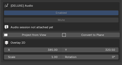
- Enabled: Turns synced Deluxe audio on or off for the current video item. This control is only meaningful when the source actually has audio available.
- Mute: Mutes the current audio session without disabling Deluxe audio entirely.
- Volume: Item-specific audio volume from 0.0 to 1.0. This can also be changed from the Inspector for video items.
- Source: Shows whether audio is being played from a cached file or another resolved source.
- Frame Sync: When the source reports an FPS clock, Superposer uses that to keep audio aligned to video timing.
- Status: Can report states such as Ready, Playing, Paused, Buffering, Disabled, Unavailable, or Error depending on the current playback situation.
- Speed Mismatch: If you set a playback speed that differs too much from the source timing, Superposer disables synced audio for that item to avoid obvious drift.
Deluxe Widget Settings
The Deluxe panel controls the appearance of the in-viewport GPU player widget for video items.
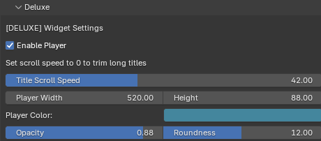
- Enable Player: Shows or hides the Deluxe video player widget for video items.
- Title Scroll Speed: Controls how quickly long titles scroll inside the widget. Setting this to 0 disables the scrolling animation.
- Player Width: Width of the widget in pixels.
- Height: Height of the widget in pixels.
- Player Color: Base color of the widget.
- Opacity: Opacity of the widget background and body.
- Roundness: Corner roundness of the Deluxe player panel.
Note: This Documentation is also available in the Documentation Website: Peek a Node Docs
Table of Contents
- Welcome
- Installation
- Quick Start Guide
- Global Collections
- Hierarchy & Operations
- Custom Collections
- Nodes in Peek
Welcome to Peek a Node
Peek a Node is the ultimate add-on for Blender that simplifies your node workflow.
Getting Started
Check out the Quick Start Guide to get up and running in minutes.

Documentation Sections
- Global Collections: The easiest way to using Peek.
- Hierarchy & Operations: Manage node groups, root materials, and variants.
- Custom Collections: Curate specific parameters inside node groups.
- Nodes in Peek: Individual node operations and organization.
Videos
Documentation PDF Versions
Installation
Getting started with Peek a Node is simple. Follow these steps to install the add-on in Blender.
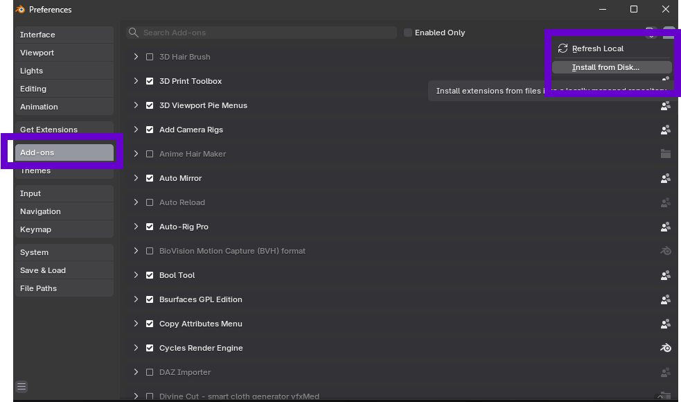
1. Open Preferences: Navigate to Edit > Preferences > Add-ons.
2. Install from Disk: Click the Install... button (or "Install from Disk..." from the dropdown).
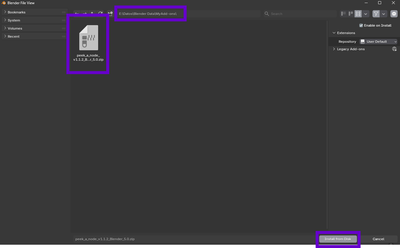
3. Locate File: Navigate to where you downloaded the .zip file for the add-on. Select it and click Install Add-on.
4. Enable: Enable the add-on by checking the box next to its name.
You are now ready to use Peek a Node!
Quick Start Guide
Get up and running with Peek a Node in minutes.
1. Installation
First, install the add-on via Blender Preferences. (See Installation Guide above).
2. Basic Usage (Global Collections)
The fastest way to use Peek is with Global Collections.
- Open the Shader Editor.
- Right-click on any node.
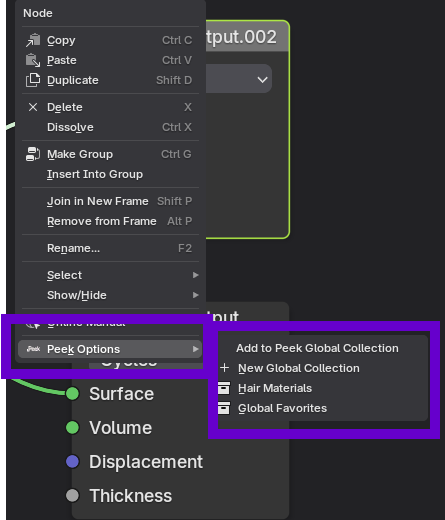
- Select Peek Options -> New Global Collection.
- Name your collection.
The node will instantly appear in the Peek Sidebar (N-Panel), allowing you to edit it without searching through the node graph.
3. Advanced Usage (Node Groups)
For complex materials using Node Groups, use the Peek Hierarchy.
- Right-click on a Node Group.
- Select Peek Options -> Peek Node Group.
- Navigate inside the group and add nodes to Custom Collections.
Global Collections
Global Collections are the easiest way of using Peek. These are node collections that can be seen globally from the Peek sidebar panel.
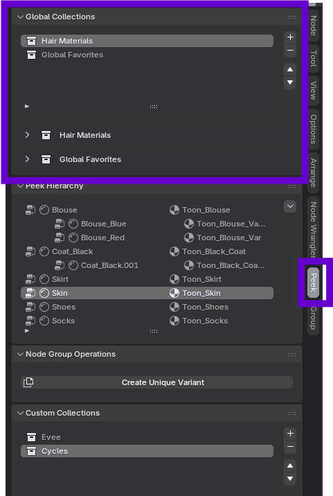
Adding a Node to Global Collections
Right-click on any node in the shader editor that you want to add to the sidebar and select:
(If collections already exist, you will see them listed or can create a new one)
Enter the name of the collection when prompted, and the node will appear in the Global Collections sub-panel.
Managing Collections
You can add, delete, and reorder the node collections using the up/down arrows next to the Global Collections List.
WARNING: Nodes in a global collection are bound to the specific material to which they belong.
If you later add the parent node group to the Peek Hierarchy (Advanced Mode), nodes in Global Collections from that group will be pruned to prioritize the hierarchy view.
Hierarchy & Operations
The core power of Peek a Node comes from its Hierarchy system, allowing you to manage node groups and materials contextually.
Peek a Node Group
To start, right-click on any node group and select:
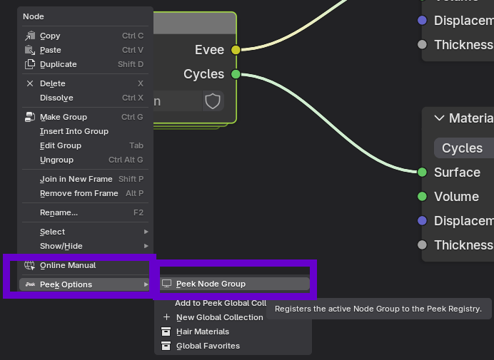
This adds the node group to the Peek Hierarchy.
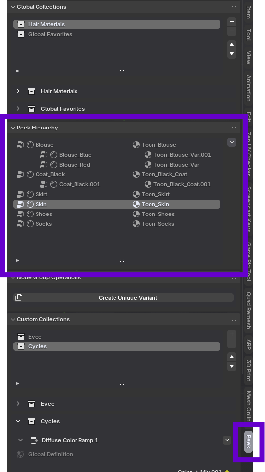
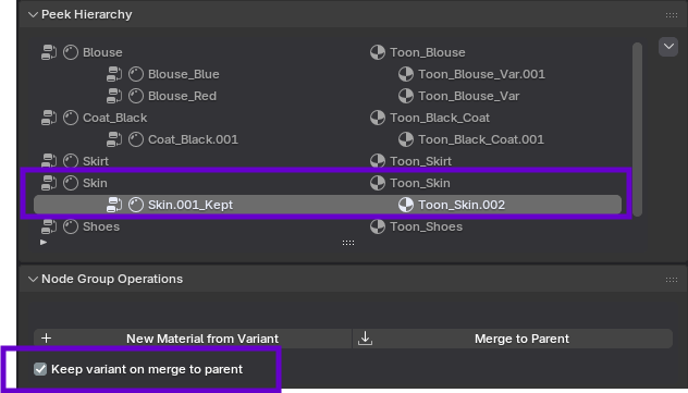
The Peek Hierarchy
The hierarchy shows the relationship between your node groups and the materials they belong to.
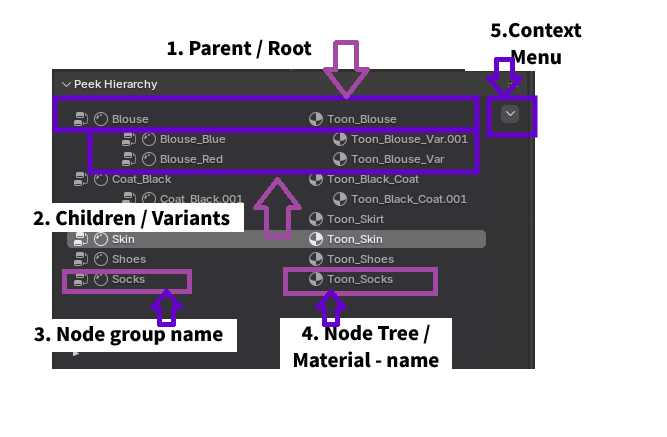
Parts of the Hierarchy
- Parent or Root Material: A root level material in the Hierarchy, from which variants can be created.
- Children Variants: Variants of the root material are displayed with an indentation below the root material.
- Node Group: The node group that is being visualized in the Hierarchy. Its name can be changed by double clicking it.
- Node Tree / Material: The node tree / material that the node group belongs to. Its name can be changed by double clicking it.
Hierarchy Context Menu
Clicking the dropdown arrow next to a hierarchy item reveals the following management operations:
- Apply Material to Selected Object: Instantly applies the current material—including all active Peek configurations and variants—to any other objects currently selected in the 3D Viewport. This ensures consistent material assignment across your scene.
- Remove node group and material from file: Permanently deletes the node group data from the Blender project file. Caution: This is a destructive action that will remove the node group from all materials that reference it.
- Remove from peek view: Stops tracking this node group in the Peek sidebar. The node group and its data remain in your project and material, but it will no longer clutter your Peek Hierarchy interface.
Node Group Operations
As mentioned earlier, Peek distinguishes between a Root Material (the original) and Variants.
Root Material
When a node group is first added to the hierarchy, it is designated as the Root Material. This represents the master version of your material.
Node Group Operations Panel -> Create Unique Variant
This creates a new unique variant material instance that branches off from the root, allowing for safe experimentation.
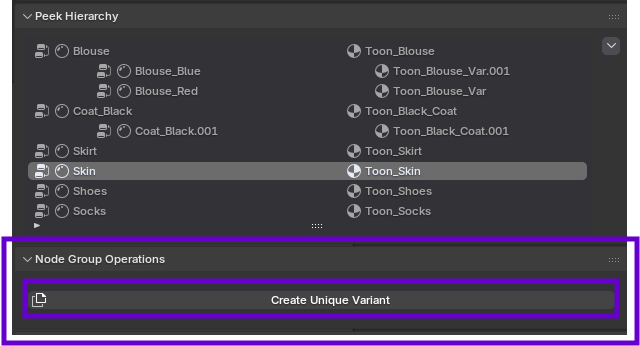
Unique Variants
A Unique Variant appears as a child of the Root Material in the hierarchy. This structure allows you to manage multiple iterations of a material on the same object or across different objects.
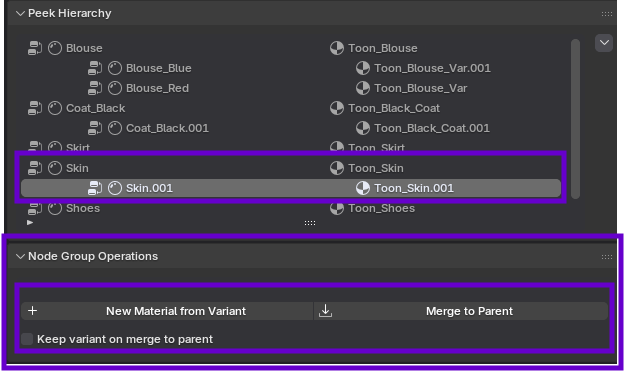
Merging Variants To Parent
Once you are satisfied with a variant, you can commit its changes back to the Root Material or manage its persistence (Peek allows you to save as many variants as you need from a Root Material) using the Merge operations.
Merge to Parent:
This option from the Node Group Operations Panel overwrites the Root Material's settings with those of the currently selected variant. This effectively promotes the variant to become the new Root Material from which subsequent variants will inherit.
New Material from Variant:
This option from the Node Group Operations Panel creates a new material from the currently selected variant. The variant won't depend on the Root Material anymore and it's currently the only way to remove a variant from a Root Material.
Option: Keep Variant on Merge
This toggle controls the post-merge behavior of the variant itself:
- If Disabled (Default): The variant is deleted after its settings are merged into the Root. The object reverts to using the updated Root Material.
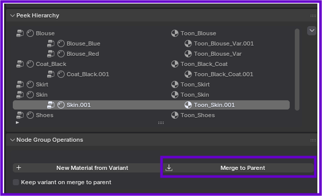
- If Enabled: The variant is preserved as a separate, independent, and unlinked material on the object, even after its settings have been merged into the parent Root.
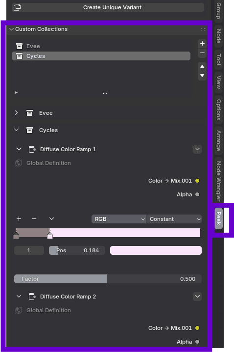
Custom Collections
When you have added a Node Group to the Peek Hierarchy, you can curate exactly which parameters are exposed in the sidebar using Custom Collections.
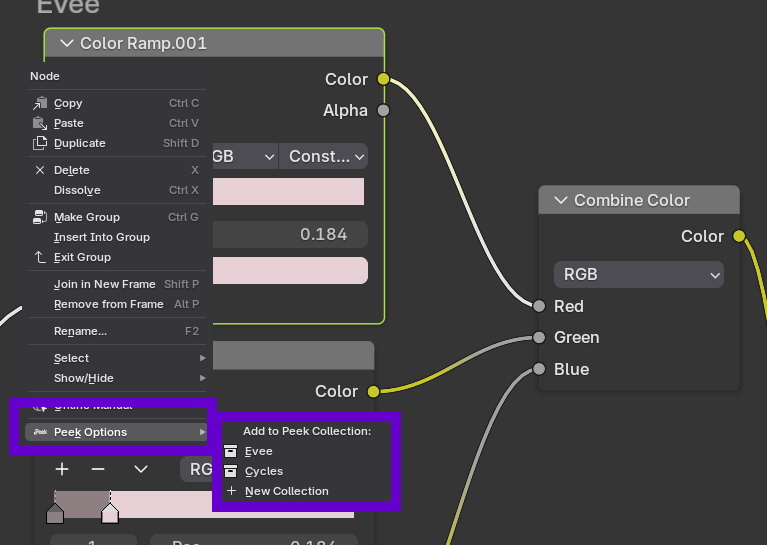
Creating a Custom Collection
Inside the node group you are peeking:
- Right-click on a node you want to expose.
- Select: Context Menu -> Peek Options -> New Collection.
- Enter a collection name (Default is "My Controls").
The node will appear in the Custom Collections sub-panel of the sidebar. This allows you to build a clean, custom interface for complex node groups without exposing every single node.
Nodes in Peek
Individual nodes within the Peek sidebar have their own context menu for quick organization.
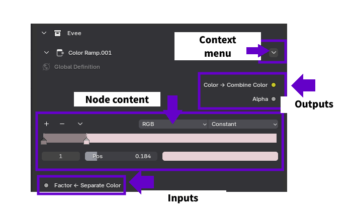
Node Operations
Clicking the dropdown arrow on a node provides the following options:
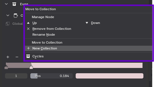
- Up/Down Arrows: Relocates the node within the current collection, allowing you to reorder parameters for better visual organization and logic flow.
- Remove from Collection: Unlinks the node from the current Peek collection. This is a non-destructive action; the node remains fully functional (and visible) within the Shader Editor, but will no longer appear in the sidebar interface.
- Rename Node: Updates the display label of the node exclusively within the Peek sidebar. This allows for user-friendly naming conventions (e.g., "Dirt Level") without altering the actual data block name or affecting other references in Blender.
- Move Collection: Transfers the node to an existing collection or initiates the creation of a new collection. This is useful for restructuring your interface as your node graph grows in complexity.
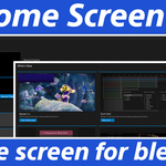
B Home Screen
Documentation
Easy install Instructions
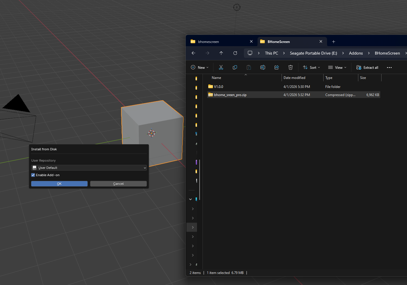
- Locate the bhome_screen_pro.zip file you downloaded.
- Drag and drop it into Blender's Interface.
- When prompted to install select "OK"
The Projects Tab
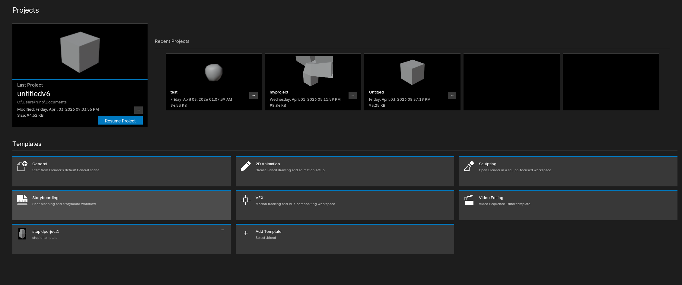
Projects, where you can resume from your latest work in progress.
Recent projects is where you can scroll with the mouse wheel or use the arrows to navigate through your recent projects up to 20.
Projects context menu
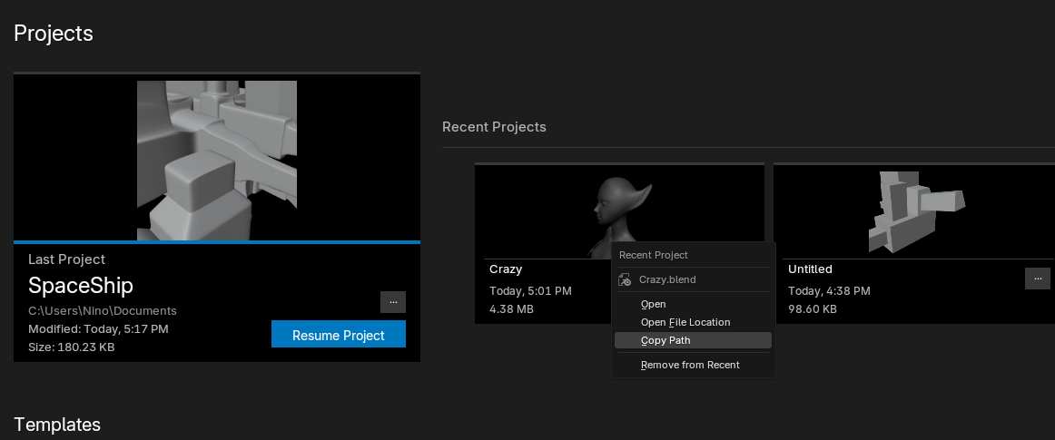
Perform actions such as:
Open; opens the blend file in blender.
Open File Location; opens your native system explorer with the route to the selected project.
Copy Path; copies the path to that project.
Templates Section
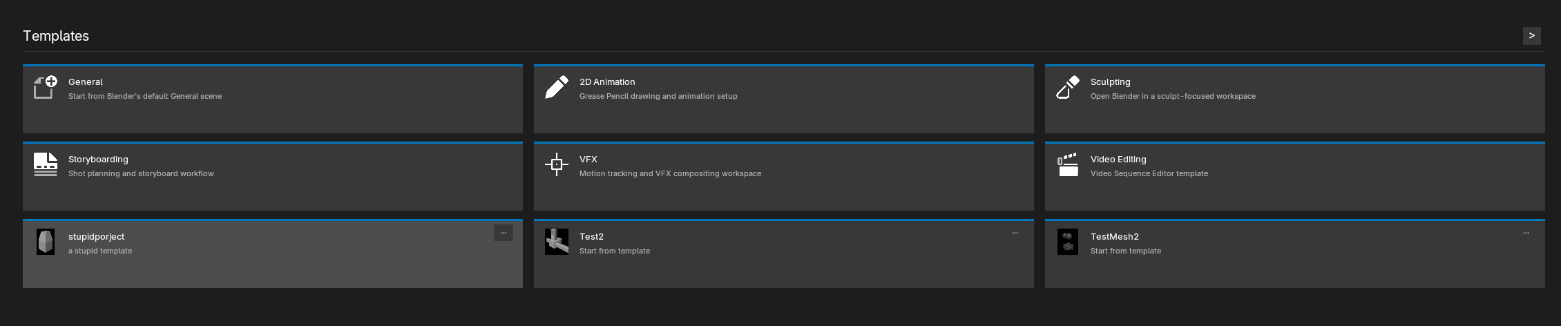
Create unlimited templates, and similarly to recent projects scroll with the mouse wheel to the next or previous pages.

To get started click on the "Add Template" button
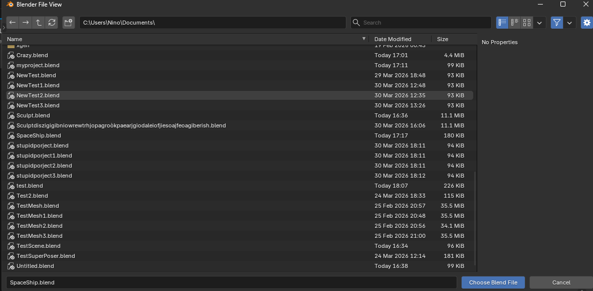
Choose a .blend file to use as template when prompted
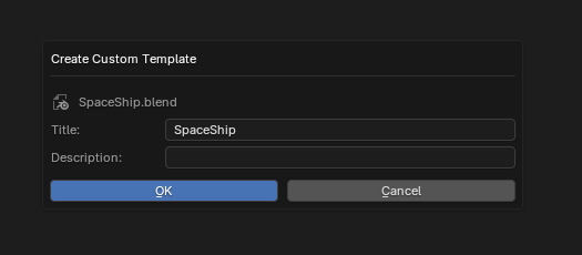
Choose a title and description for said template.
For example: I've chosen the title SpaceShip and description is empty.

Now you can see the SpaceShip Template and use it as a starting point for new projects.
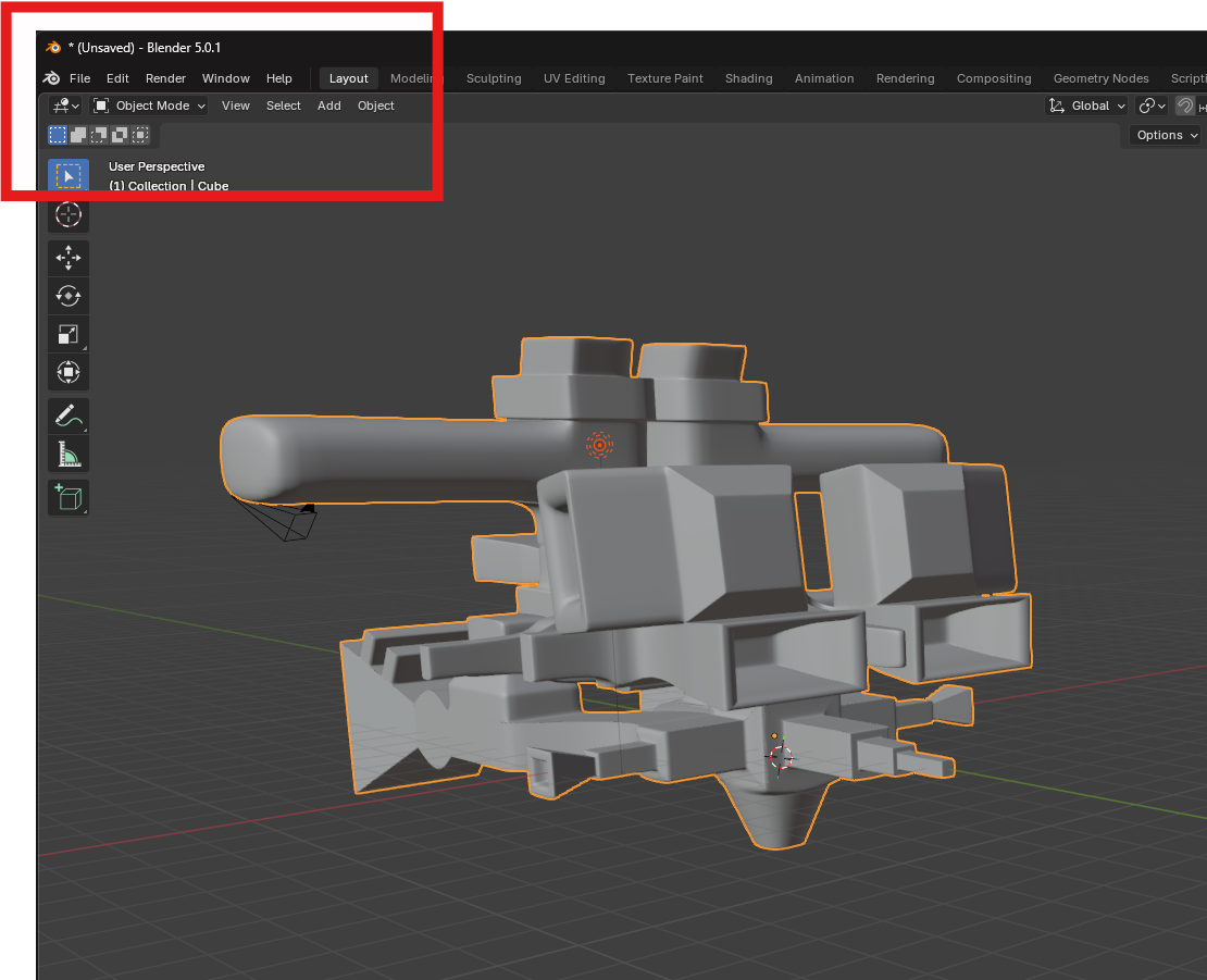
The template creates a new document.
Going back to the home screen
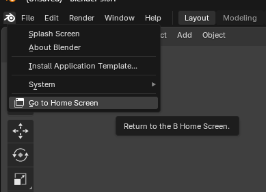
Click the blender icon and you will see the new "Go to Home Screen" button.
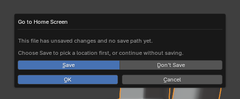
If you made changes to the document you can choose to save them before going back.
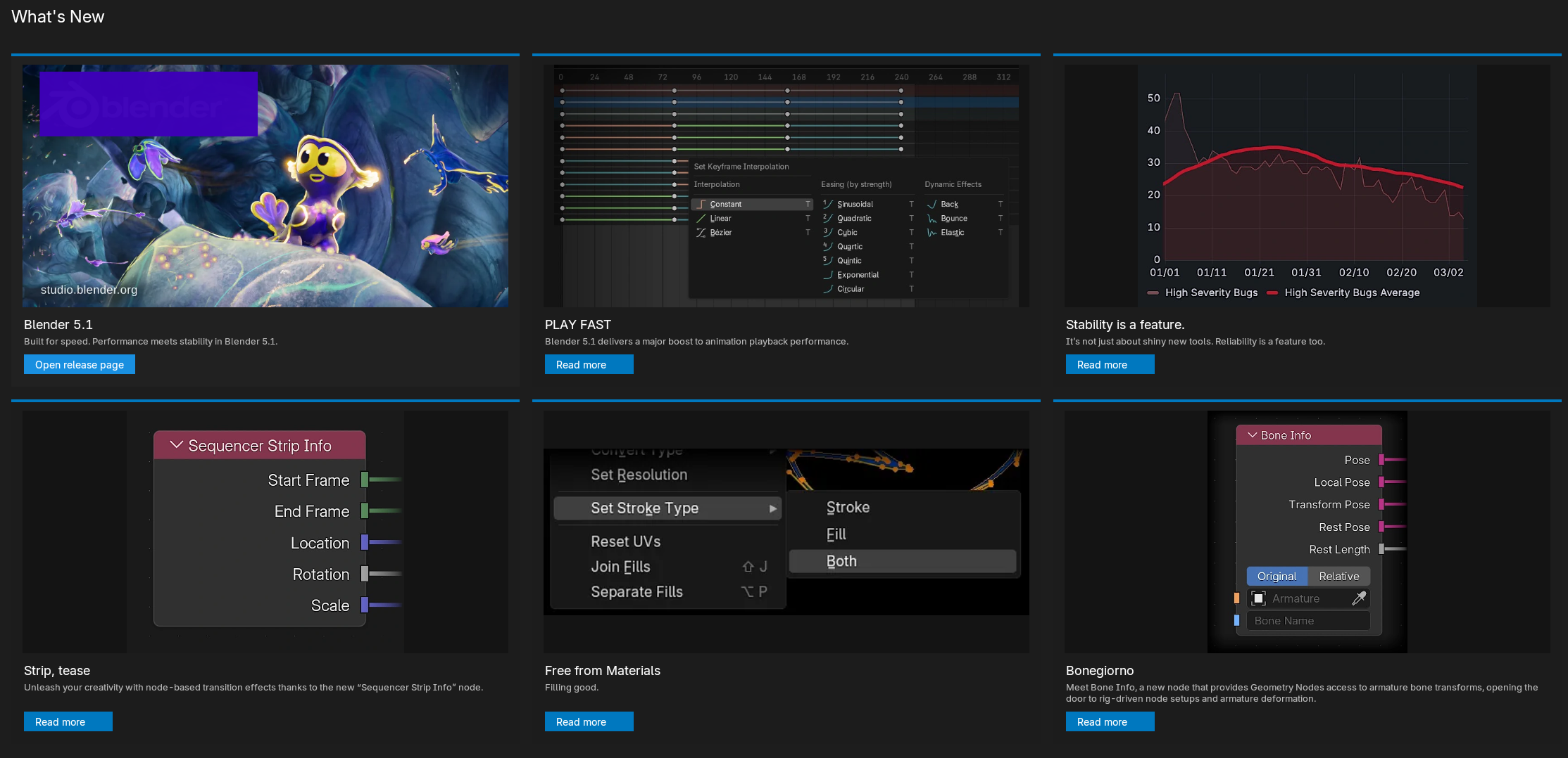
What's New Section
Here you will get up to 6 relevant updates from your current blender version. The first image is the release page where you can find the entire updates list.
Click on any link to get the exact update information you are interested on.
Community Section
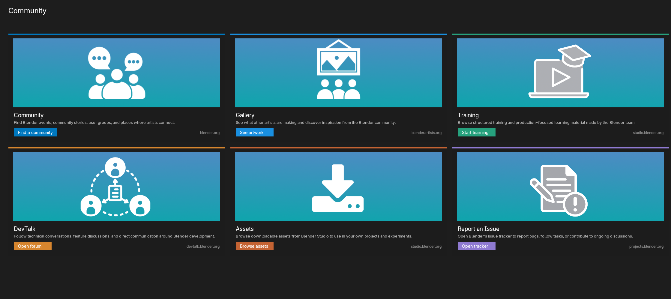
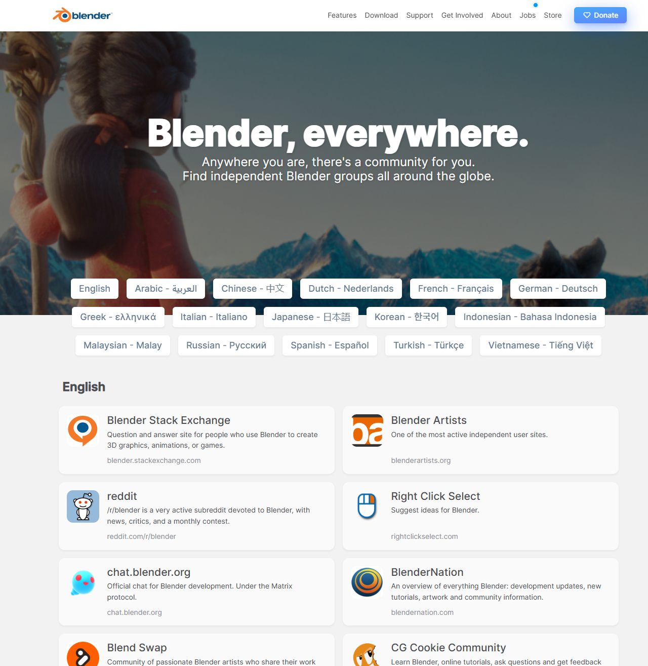
The Community link - https://www.blender.org/community/ will take you to blender's official communities repository. where you can find forums and help.
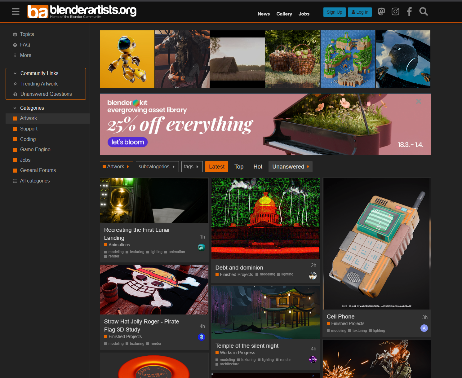
The Gallery link will take you to Blenderartists.org - https://blenderartists.org/c/artwork/8 where people posts artworks made with blender frequently.
Other links will take you to official blender communities to help you stay better connected with all the blender users.
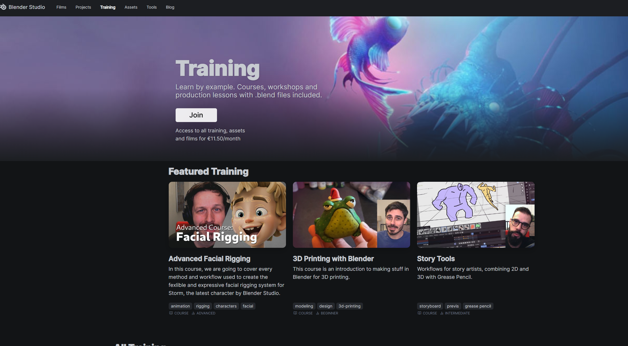
Training- https://studio.blender.org/training/ Official blender training products
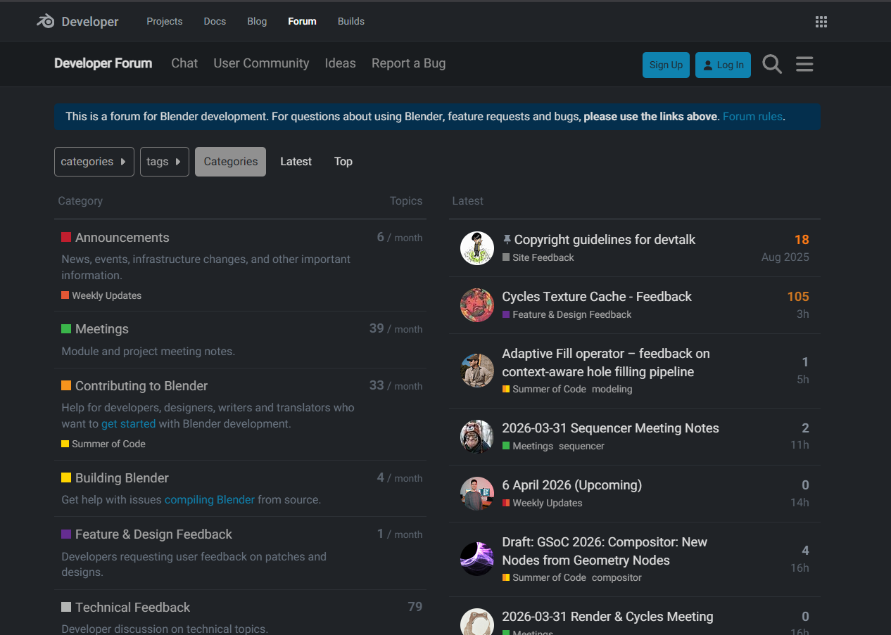
DevTalk - https://devtalk.blender.org/ a forum for blender developers
Assets - https://studio.blender.org/search/?type=asset&media_type=file
Official blender studio downloadable resources.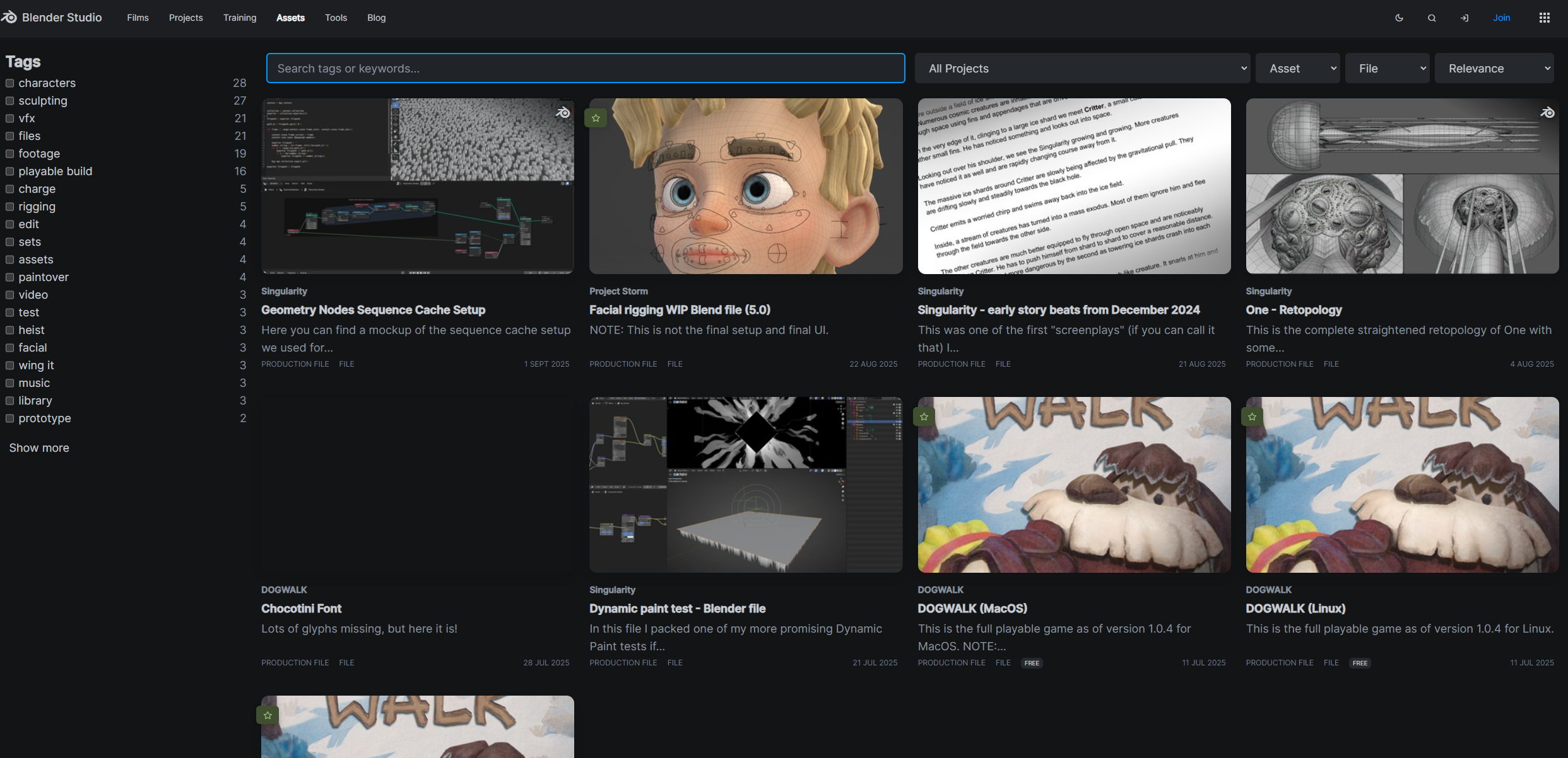
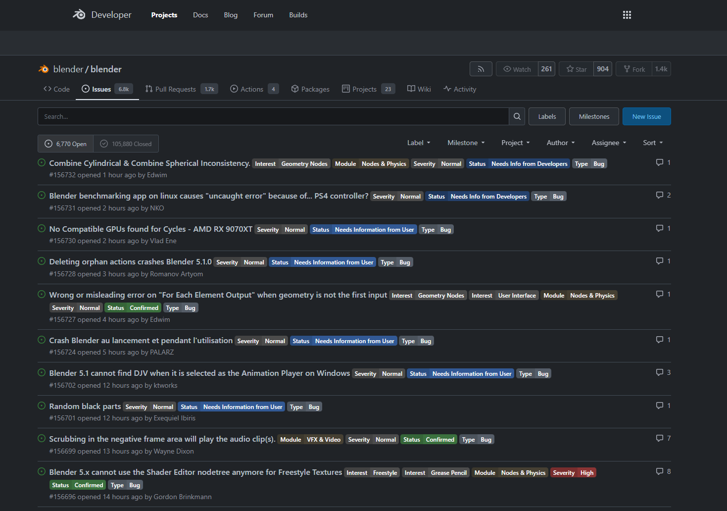
Report an Issue - https://projects.blender.org/blender/blender/issues Official blender issues tracker.
Have questions about this product?
Login to message
| Blender Extension Compatible | Yes |
| Published | 5 months ago |
| Blender Version | 4.2 - 5.1 |
| Extension Type | Add-on |
| Render Engine Used | Cycles, Eevee |
| License | GPL |

Discover more products like this
bundle 3d-user-interface references pie menus 2026spring nodes n-panel tabs home-screen