 SkdSam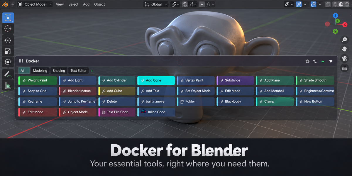
Docker — Floating Action HUD & Quick Links for Blender
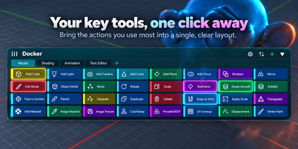
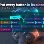
A high-performance, GPU-accelerated floating action HUD and workflow organizer. Pin your essential operators, Python scripts, linked text blocks, URLs, and folder paths directly into your workspace.
Core Highlights & Capabilities
Interactive, draggable, resizable HUD overlay available across 7 core editors (3D Viewport, UV/Image, Shader/Geometry Nodes, Sequencer, Dope Sheet, Graph, and Text Editor).
Right-click almost any Blender property, menu item, or operator and choose "Add to Docker" to automatically resolve its target context, space, and region.
Instantly filter dozens of buttons as you type by label, operator ID, script command, or category name with one-click search clearing.
Buttons automatically show clean action badges (⚡ Operator, 🐍 Script, 📄 Text, 🔗 URL, 📁 Path) or display your own custom PNG/JPEG icons.
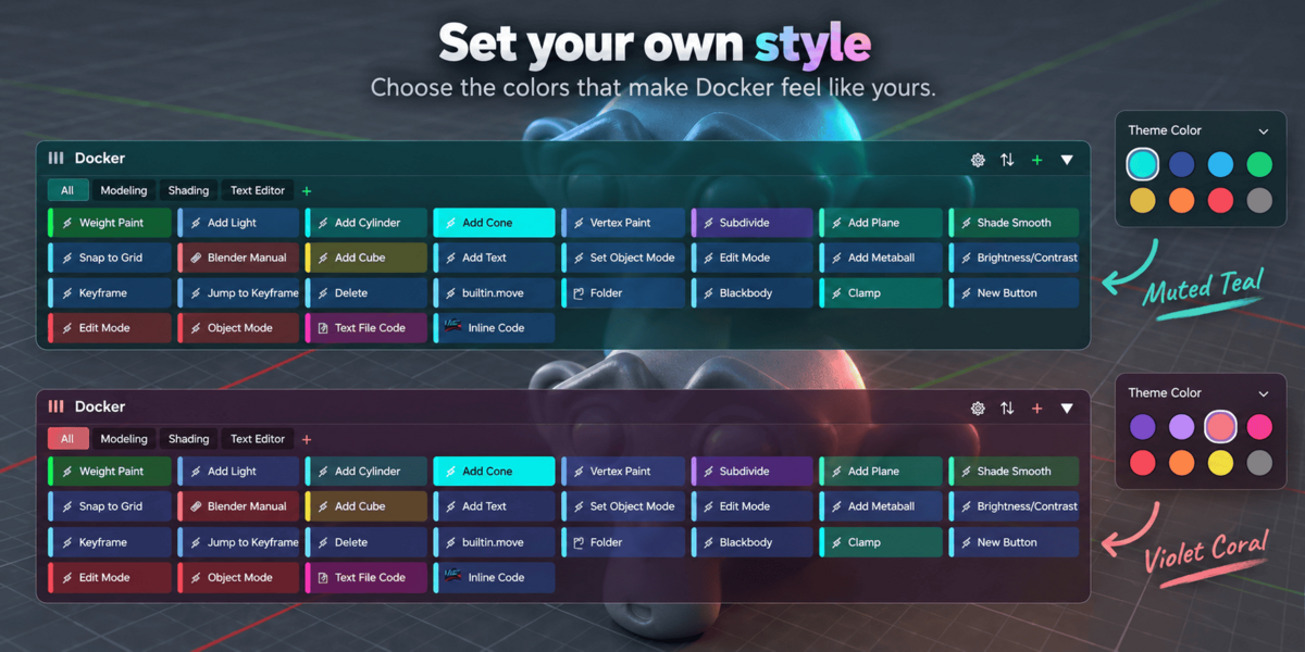
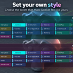
Customizable theme styling with built-in presets (Blender Modern, Cyberpunk Neon, Minimal Graphite, etc.), individual button colors, and a global opacity slider.
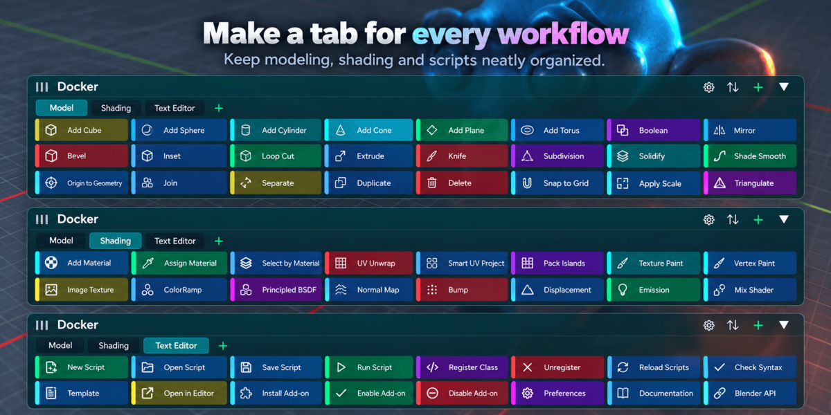
Group buttons into custom tabs (e.g. Modeling, Shading, Rigging) or lock buttons so they only appear in specific workspaces (e.g., Layout or UV Editing).
Supported Button Action Types
How to Use the Button Features
You can add buttons through three fast methods:
- Right-Click Context Menu: Right-click on any Blender button/slider and choose "Add to Docker".
- From N-Panel: Open the Docker tab in the sidebar (press N), expand Buttons, and click + Add.
- From Clipboard: Copy Python code or an operator call to your clipboard and click Paste.
Buttons automatically feature clean action-type badges by default:
- Click the Image icon (🖼️) on any button row in the N-panel to pick your own PNG or JPEG.
- The image is automatically cached and rendered with GPU texture acceleration directly on the HUD button.
- Click the X next to the image icon at any time to remove the custom image and revert to the default badge.
Keep large libraries of actions organized:
- Category Tabs: Create custom categories like Modeling, Shading, Rigging with the + button. Switching tabs filters the HUD instantly.
- Live Instant Search: Type in the search bar above the N-panel button list to filter buttons on the fly. Click the ✖ icon to instantly clear the filter.
Control where buttons appear:
- By default, buttons appear in all workspaces.
- Uncheck "Show in All Workspaces" in the button settings, or click + Bind WS to bind it only to your current workspace (e.g. UV Editing).
- If restricted, click the X on the
WS: ...row to immediately remove the restriction and restore visibility everywhere.
Full interactive control directly in your 3D Viewport or Node Editor:
- Move HUD: Click and drag the top header bar to place the HUD anywhere on screen.
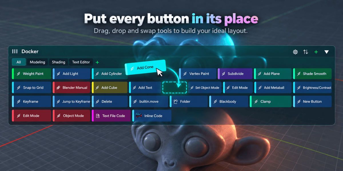
- Reorder Buttons: Click and drag any button to reorder its position within the layout.
- Layout Direction: Click the layout toggle icon (⇄ / ⇅) in the HUD header to flip between Vertical column and Horizontal multi-row grid flow.
- Collapse / Minimize: Click the collapse arrow (▲ / ▼) to collapse the HUD into an unobtrusive pill.
- Quick Edit: Right-click directly on any button in the HUD to open its configuration popup.
💾 Presets, Export & Sharing
Your configuration is automatically saved globally in Blender's user preferences, persisting across all blend files and sessions.
Have questions about this product?
Login to message