Simply Themes
 VjaceslavT
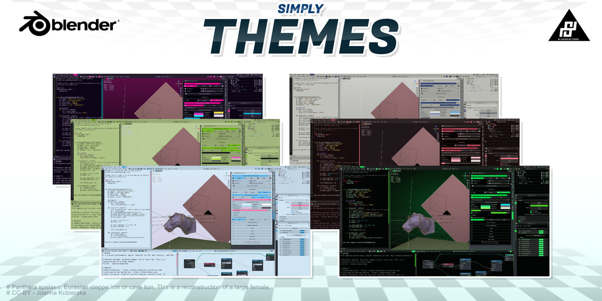
WHERE TO FIND IT
Open a 3D Viewport, press N to open the Sidebar, and select the
"Simply Addons" tab. The Simply Themes panel is shown there.
================================================================================
1. THEME COLLECTION
================================================================================
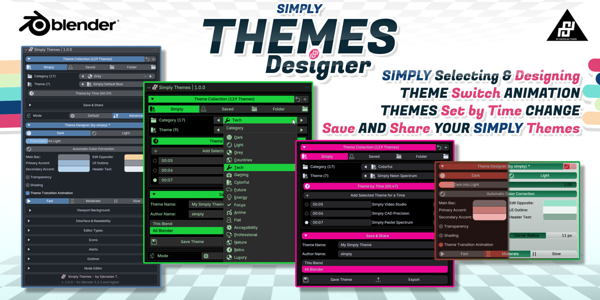
Theme Collection
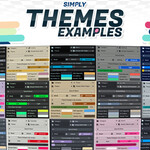
Shows the available theme total. The bundled collection currently contains
129 themes in 17 categories.
Simply / Saved / Folder
Simply uses the bundled themes. Saved uses themes created with Save Theme.
Folder loads XML themes from an external folder.
Category
Select one of the 17 bundled categories. The left and right arrows cycle
through categories.
Theme
Select a theme from the active source and category. The arrows cycle
through the available themes.
Add Folder
Choose an external folder for custom XML themes.
Save & Share
Save the current look as a named theme, choose whether it is kept globally
or with the current blend file, and export it for sharing.
================================================================================
2. THEME DESIGNER
================================================================================
Mode
Default shows the essential controls. Advanced adds icons, alerts,
Outliner, Node Editor, and additional editor controls.
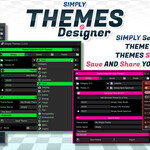
Theme Designer
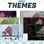
Edit the main palette, accent colors, text colors, transparency, shading,
corner roundness, and overall dark/light mood.
Reset
Reload the selected theme and discard unsaved changes.
================================================================================
3. READABILITY AND VIEWPORT
================================================================================
Interface & Readability
Adjust Blender UI scale, line width, border width, and corner handles.
Text & Readability
Set text and selected-text colors, text size, anti-aliasing, hinting,
and optional text shadow.
Viewport Background
Choose a single-color or gradient viewport background and set
anti-aliasing.
================================================================================
4. ADVANCED CONTROLS
================================================================================
Editor Types
Select an editor such as the 3D Viewport, Image Editor, Node Editor,
Outliner, or Timeline. Load its current colors, then enable
"Customize This Editor" to override them independently.
Icons
Adjust icon alpha, saturation, border intensity, and selected icon colors.
Alerts
Set the colors used for error, warning, information, and success states.
Outliner
Customize the Outliner background, text, header, rows, matches, and
object-state colors.
Node Editor
Customize shared node-editor colors, node categories, and newer node zones.
================================================================================
5. QUICK WORKFLOW
================================================================================
1. Choose a theme from Theme Collection.
2. Select Default or Advanced mode.
3. Adjust the colors and readability controls.
4. Use Reset if you want to discard unsaved changes.
5. Open Save & Share and choose Save Theme.
6. Export the theme if you want to back it up or move it to another setup.
-
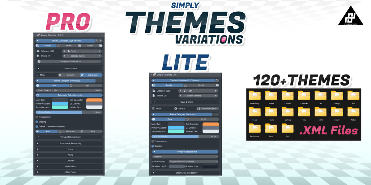
$9
13 themes plus the add-on with basic customization, save and export.
-
$15
all 129 Simply Themes as XML files, without the add-on!
-
$21
all 129 themes plus the full add-on with every Advanced feature.
 Included
Includes 12 months of
- Support from VjaceslavT
- Product updates
Extend this product’s Support Period +12 months: 50% of product price
Have questions before purchasing?
Login to message
| Blender Extension Compatible | Yes |
| Dev Fund Contributor | |
| Published | 5 days ago |
| Blender Version | 5.2 |
| Extension Type | Add-on |
| Render Engine Used | Cycles, Eevee, Luxrender |
| License | Mit |