SiteStage - Website Builder
 GPolygon Design
Documentation
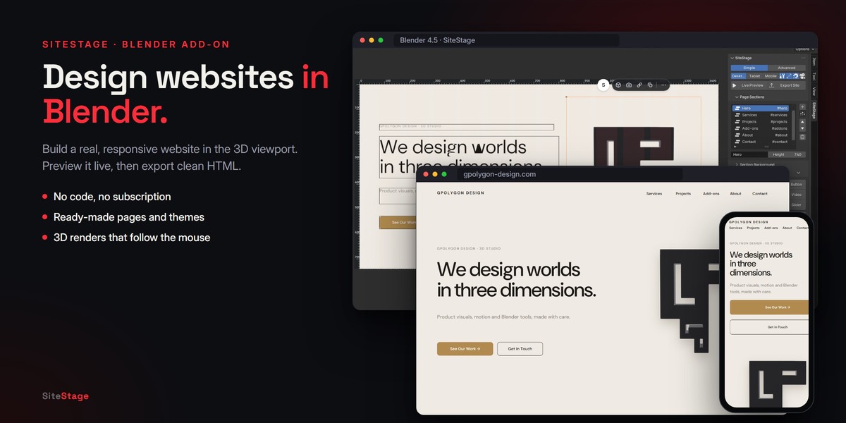
SiteStage works in the 3D Viewport sidebar. Every heading, button and image on your page is a Blender object: you click it, move it and style it in the viewport, and SiteStage writes a real website from it.
1. Installation
- Download
sitestage-1.0.0.zip. Do not unzip it. - In Blender, open Edit > Preferences > Get Extensions. Click the arrow in the top-right corner and choose Install from Disk…, then select the zip.
- In the 3D Viewport, press N to open the sidebar and click the SiteStage tab.
SiteStage needs Blender 4.2 or newer. It is tested on Blender 4.2 LTS, 4.5 LTS, 5.1 and 5.2 LTS.
2. Quick start
- Click Create New Site. Pick a page under Start With, then a Style or a color Theme, and press OK.
Selling a product? Click Product Page from a 3D Model instead and pick your model file (see section 3b). - Click any element in the viewport to edit it.
- Press Live Preview to see the site in your browser. Leave it on while you work.
- Press Export Site, choose where to save the website and give its folder a name.
- Upload the folder to any static host.
3. Ready-made pages
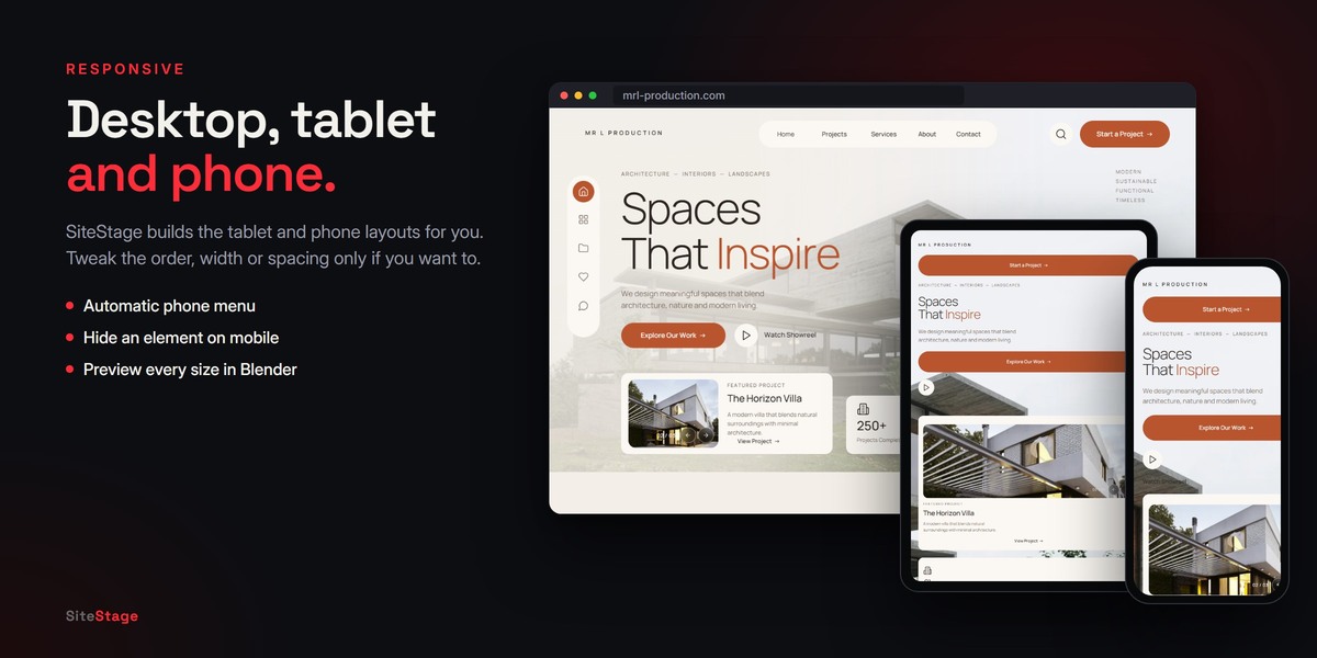
Create New Site offers:
- Blank Page: one empty section.
- Sample Studio: a one-section sample design.
- Portfolio: menu, hero, work, about and contact.
- Cafe / Restaurant: menu, hero, products, gallery and contact.
- Agency / Company: menu, hero, services, projects and contact.
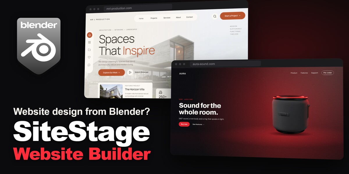
- Architecture Studio: pill menu, side icons, a featured project slider, stats, projects, services, studio and contact.
Every menu link already points to its section. All text, links and images can be changed.
3b. Product Page from a 3D Model
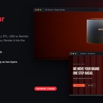
One click turns a 3D model into a complete product launch page.
- On the start panel (or in Publish and SEO), click Product Page from a 3D Model.
- Pick your model: GLB, glTF, FBX, OBJ or STL. On the right of the file browser, type the Product Name (empty uses the file name) and the Price, and keep Product Colors on if you want color choices.
- Click Product Page. SiteStage sizes and centers the model, lights it in a studio with a rim light in the theme color, frames it and renders everything. This takes about one to two minutes.
You get:
- A hero where the product stands in front of its big name.
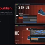
- Three feature sections: as the page scrolls, the product turns to a new view in each one (as framed, from above, from behind, from the side) and glides from one side to the other. The text always sits on the other side.
- In 3D: a Live 3D view the visitor can turn and zoom, with AR on phones.
- Every Angle: three round renders on glass cards.
- The name in giant letters filled with a close-up of the product.
- A Buy section, a footer and numbered side navigation.
- Three product colors (graphite, the theme color, sand) as buttons under the product.
Everything is ordinary SiteStage content: replace the placeholder texts with your own and change any color, image or setting. The product's motion and colors are set in its Motion and Colors toolbar button (section 13).
Ready-made styles
A style sets the whole look of a site in one step: a color theme, its two fonts, the corners and a moving background for the first screen (the hero).
- Product Launch: a dark stage with a drifting red back light, for one product.
- Agency & Studio: black, off-white and red, with squares that thin out toward the text.
- Tech & SaaS: deep navy with a sweeping cobalt blade.
- Luxury & Fashion: black and champagne gold, serif headings and slow light bars.
- Cafe & Restaurant: espresso and amber, with warm steam rising.
Choose one under Style in Create New Site, or apply one later with Apply a Ready-Made Style in Theme, Color and Font. Your texts and images stay as they are. The moving background shows in Live Preview.
4. The panel at a glance
From top to bottom:
- Simple / Advanced: Simple shows the essentials and leaves the rest to the element toolbar. Advanced shows every setting: links, type details, corners, borders and gradients, effects, mobile layout, rulers and grid, and publishing options.
- Desktop / Tablet / Mobile: switch the preview in the viewport. You design at desktop size (1440 px wide); the tablet (768 px) and phone (390 px) layouts are made for you.
- The four small icons next to them:
- Element toolbar on or off.
- Rulers on or off.
- Snapping on or off.
- Frame the camera on the page.
- Live Preview and Export Site.
- Page Sections, Section Background, Add Element, Selected Element, Theme, Color and Font, Rulers, Grid and Layers (Advanced) and Publish and SEO.
Panels that start closed open with a click on their header.
5. Page sections
Page Sections lists every part of the page, from the top menu to the footer.
- Click a section to jump to it in the viewport.
- + adds an empty section.
- The preset button next to + inserts a Ready-Made Section: Top Menu, Hero, About, Services, Projects, Gallery, Contact or Footer.
- Gallery from Cameras… in the same menu renders every camera of a scene into a ready gallery section.
- The arrows change the order; the trash can deletes the section.
- Below the list you can rename the section and set its Height in pixels.
- Side Navigation adds numbered dots (01, 02, 03…) on the right edge of the page; each one jumps to its section and the current one lights up. Desktop only.
The name after # is the section's address. Links and menus use it, for example #contact.
6. Editing in the viewport
-
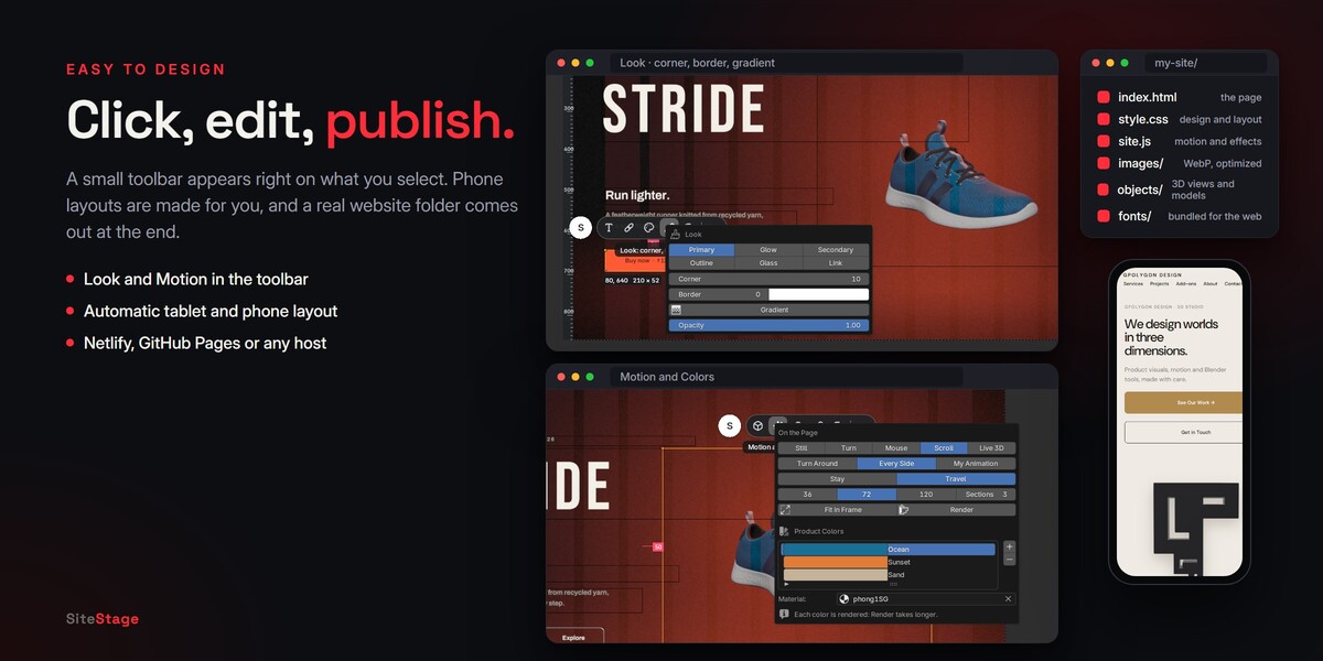
Click an element to select it. A small toolbar appears right on it. Hover a button to see its name. Depending on the element, the toolbar offers:
- Text, Image, Video or Slides
- Link and Icon
- Color
- Look (brush): button look or card style, Corner, Border, Gradient and Opacity, and Circle for images.
- On a 3D object: 3D Scene, Motion and Colors and Render (see section 13).
- Duplicate
- ··· menu: align, size, order, motion, shadow, pin, mobile, lock and delete.
- Drag to move. Press S to resize, just like any object in Blender.
- Double-click a text element to edit it line by line.
- Write
*word*to show a word in the accent color.
The round button at the left of the toolbar opens the sidebar settings of the element.
7. Add Element
Add Element places a new piece below the selected element, or at the end of the current section:
- Heading, Text, Button, Card
- Image, Video, Slider
- Form, Icon (more than 70 line icons)
- 3D Object: see section 13.
The arrow in the panel header opens Selection:
- Select All in Section
- Duplicate Selected
- Move to Another Section
- Delete Selected
8. Selected Element
Shows the settings of whatever you click:
- Text (or Description / Button Text). The pencil button opens a larger text editor.
- Icon: the icon, its Frame (None, Soft, Strong) and Line Weight.
- Slider: the list of slides, each with an image and a title, and autoplay.
- Logo Strip / Carousel (Advanced mode, Moving Rows and FAQ panel): select two or more elements, then press Logo Strip (scrolls on its own in an endless loop; it can pause under the mouse) or Carousel (visitors scroll it with arrows, mouse drag or a swipe). Set the gap and the loop speed or the arrows there; Stop (Ungroup) turns it back into normal elements.
- Sideways on Scroll: in the same panel: the section holds still while the page scrolls and the row slides sideways, edge to edge (on phones it becomes a swipe row).
- Count Up: in an element's Motion menu: numbers in the text (250+, $2.1B, 4.6%) count up from zero when they come into view.
- Before / After: an image's Before field: pick a second picture (a sketch, a clay render, an old photo) and visitors drag a line across the image to compare.
- Fit Inside / Fill Box: an image's Fit setting: Fill Box crops the picture to the box, Fit Inside shows all of it (logos, cut-out PNGs). The viewport shows it the same way.
- Divider: Add Element panel: a thin line across the section (a 1 px card you can resize and recolor).
- FAQ (Click to Open): in the Moving Rows and FAQ panel, or as a ready-made FAQ section: the first line of each card is the question, a click opens the answer, one at a time.
- Pricing: a ready-made section with three plans; the middle one is highlighted.
- Form: a Formspree address (Service) or an Email.
- Image / Video: the File, or a direct Video URL. The circle button next to an image's file shows it as a Circle.
- Heading: Image in Letters fills the letters with a picture (best with big, bold titles).
- Look (buttons): Primary, Glow, Secondary, Outline, Glass or Link. Cards: Solid, Outline, Glass (Blur), Glowing or Text Only.
- Size: Small, Medium or Large, and a button that fits the box to its text.
- Color: follows the theme (Normal, Muted or Accent text). Click the brush button to pick your own color and fill.
In Simple mode the link, look and effects are in the element toolbar. In Advanced mode you also get:
- On click, go to: None, Section, Web, Email, Phone, with Open in new tab for web addresses.
- Align: left, center or right in the section.
-
Effects (a closed sub-panel):
- Shadow: None, Soft, Strong
- Pin to Screen: Scrolls, Top, Bottom
- Motion: None, Reveal on Scroll, Gentle Float, Soft Pulse
- Hover: Glow Softly, Lift, Fill, Zoom, No Change
Size and Type Details (Advanced) sets the exact width and height, the font, size, weight, line height, letter spacing, letter case and alignment, and for boxes and pictures:
- Padding and Corner radius
- Border: thickness in pixels (0 = none) and color
- Gradient: fills a button, card or form with a blend from its fill color to a second color, at the angle you set (0 up, 90 right, 135 diagonal)
- Opacity of the fill
If you choose a system font, check its license before you use it on a website.
The buttons in the panel header duplicate, lock or delete the element. A locked element cannot be moved by accident.
9. Themes, colors and fonts
Open Theme, Color and Font.
- Theme applies one of 20 color themes, dark and light, with a matching pair of fonts.
- Apply a Ready-Made Style sets a theme, fonts, corners and a moving hero background at once (see Ready-made styles).
- Heading and Text choose the two fonts of the page. SiteStage bundles 14 open-license fonts: Inter, Manrope, DM Sans, Space Grotesk, Archivo, Montserrat, Syne, Bebas Neue, Fraunces, Playfair Display, Cormorant Garamond, Lora, DM Serif Display and JetBrains Mono.
- In Advanced mode:
- Change each theme color: Background, Surface, Text, Muted, Accent and Button Text.
- Choose Sharp, Soft or Round corners for the whole page.
- Press Apply Theme to Whole Page to bring every element back to the theme.
An element whose color you picked by hand keeps it when the theme changes.
10. Section backgrounds
Select a section and open Section Background. Choose one of four kinds:
Color The theme background, the theme surface, or a custom color.
Image
- An image or video File, or a direct HTTPS Video URL.
-
Image Details (Advanced):
- Cover or Contain
- Focus X / Y: the part of the image that stays visible on narrow screens
- Mobile Image: a separate image for phones
- Video Poster
- Follow the Mouse: the image moves gently with the cursor; Amount sets how much.
- Over the Text: a transparent PNG drawn over the headings, for example the mountain or the person cut out of the background photo. The title then sits behind the subject. For a 3D background with Mouse Depth, Front Layer Over the Text does the same with the render's front layer.
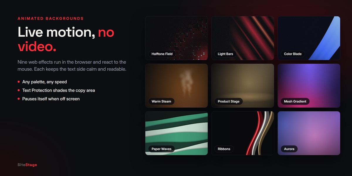
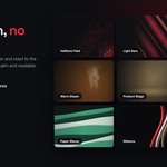
Effect An animated background that runs live in the browser, with no video and no libraries:
- Mesh Gradient: large soft color fields with a fine grain.
- Paper Waves: layered paper bands with soft shadows.
- Halftone Field: squares dense in one corner, thinning toward the text.
- Product Stage: a dark stage with a drifting back light, for a product image.
- Warm Steam: warm light with slow steam, for cafes and food.
- Light Bars: soft diagonal bars of one color.
- Color Blade: one sweeping band of vivid gradient.
- Aurora: glowing color light, best on dark sections.
- Ribbons: curving ribbons that catch the light.
Palette sets the three effect colors and the section color from a curated palette in one click. You can also pick the colors yourself.
Effect Details (Advanced) sets Speed, Motion, Scale, Mouse Interaction and its Response.
Effects pause when they are off screen and include a small pause button. For visitors who prefer reduced motion they stay still. In Blender you see their colors as a gradient; the motion shows in Live Preview.
3D A Geometry Nodes scene rendered at exactly the size of the section. See sections 11 and 12.
Darken dims the whole background. Text Protection softly shades only the area behind your headings and text, so they stay readable over photos, renders and effects (0 turns it off).
11. 3D backgrounds
- Choose 3D in Section Background.
- Pick a template:
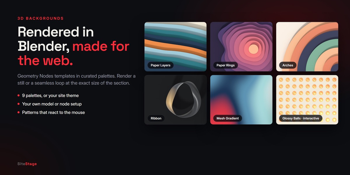
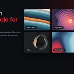
- Designed (paper-craft style with soft shadows): Paper Layers, Paper Rings, Arches, Ribbon, Mesh Gradient.
- Cinematic: Light Lines, Glass Forms, Light Beams, and Empty Studio for your own model.
- Interactive (reacts to the mouse): Glossy Balls, Magnetic Rods, Ripple Discs, Glow Orbs (see section 12).
- Designed templates have a Palette: Site Theme, Harbor, Apricot, Lagoon, Moss, Sunset, Sand, Candy or Noir.
- Click Create Scene. SiteStage builds the scene with its camera and lights.
- Choose the render quality:
- Fast uses EEVEE for quick results.
- High uses Cycles for the best light and shadows.
- Click one of:
- Image for a still background.
- Looping Video for a seamless MP4 loop. A video can take a few minutes to render.
3D Scene Settings (Advanced) changes the scene without opening it:
- Palette or color
- Density, Size / Scale and Motion
- Loop (s): the length of the loop
- Roughness where it applies
- Turn Model when the scene has a model
Render again to update the site.
Mouse Depth on Image (for scenes with separate shapes, such as Glass Forms, Light Beams and Empty Studio) renders the scene as a back and a front layer. On the website they move at different speeds with the mouse, so a still render feels three-dimensional.
Change Template replaces the generated scene with another one. Models you added are kept.
12. Interactive 3D patterns
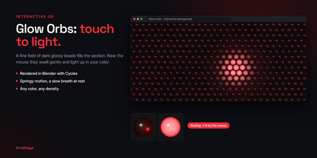
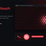
Glossy Balls, Magnetic Rods, Ripple Discs and Glow Orbs fill the section with a pattern that reacts to the mouse in the browser.
- Glossy Balls grow (or shrink).
- Magnetic Rods turn toward the cursor.
- Ripple Discs swell and glow like ripples.
- Glow Orbs are a fine field of dark glossy beads that swell and light up in your color.
Set:
- Near the Mouse: Grow or Shrink.
- Background: Dark, Light or Theme.
- The shape color.
- Density, Size and Motion in 3D Scene Settings.
Then click Make Interactive. Blender renders the shape with Cycles once; the browser repeats it across the section and animates every copy.
13. 3D objects: motion, colors and Live 3D
Click 3D Object in Add Element to place a rendered 3D object anywhere on the page, for example a logo, a character or a product. (For a whole page around one product, see section 3b.)
- Click Edit 3D Scene. A separate scene opens with a camera. The camera frame shows exactly what will be rendered.
- Model there, or bring in your file with File > Import.
- Click Fit in Frame: the camera moves so the model fills the element, with room to turn all the way around.
- Click Render and Return. The object appears on the page with a transparent background.
On the Page chooses how it moves. The same choices are in the Motion and Colors button of the element toolbar.
- Still: one render.
- Turn: turns slowly on its own, all the way around. Views 48, 96 (recommended) or 144; Seconds per Turn; Tilt for a gentle nod. The mouse turns it a little further.
- Mouse: turns toward the visitor's mouse. Left/Right and Up/Down set how far, in degrees; Smoothness renders 7 × 5 (Fast), 11 × 7 (Smooth, recommended) or 15 × 9 (Ultra) views. On phones it shows the front view.
-
Scroll: plays as the page scrolls.
- Every Side: a new view in each section — as framed, from above, from the side, from behind — swinging smoothly from one to the next.
- Turn Around: one full turn, with an optional Tilt.
- My Animation: plays the 3D scene's own animation from the start to the end frame (open, explode, move, change color…).
- Stay keeps it in its section. Travel keeps it on screen while the next Sections scroll under it, gliding to the other side in each one — put your text on the opposite side. Travel works on desktop; on phones the object plays in its own section.
- Views: 36, 72 (recommended) or 120.
- Live 3D: real-time 3D in the browser. Visitors drag to turn and scroll to zoom; AR on Phones lets them place it in their room; Turn Slowly turns it on its own. The model is written as a GLB. Live 3D uses the free model-viewer library, loaded from the internet when the page opens.
Product Colors (a closed sub-panel, also in Motion and Colors): click + to add colors. Each color is rendered (for Turn and Scroll) or applied live (Live 3D), and the website shows round color buttons under the object. Material chooses which material changes color; empty uses the one on most of the model. A texture on that material is replaced by the color. Every color is rendered separately, so Render takes longer.
Rendered views cross-fade on the website, so motion is smooth. They load when the object comes near the screen. Render again after changing the scene or the motion.
14. Your own model in a background
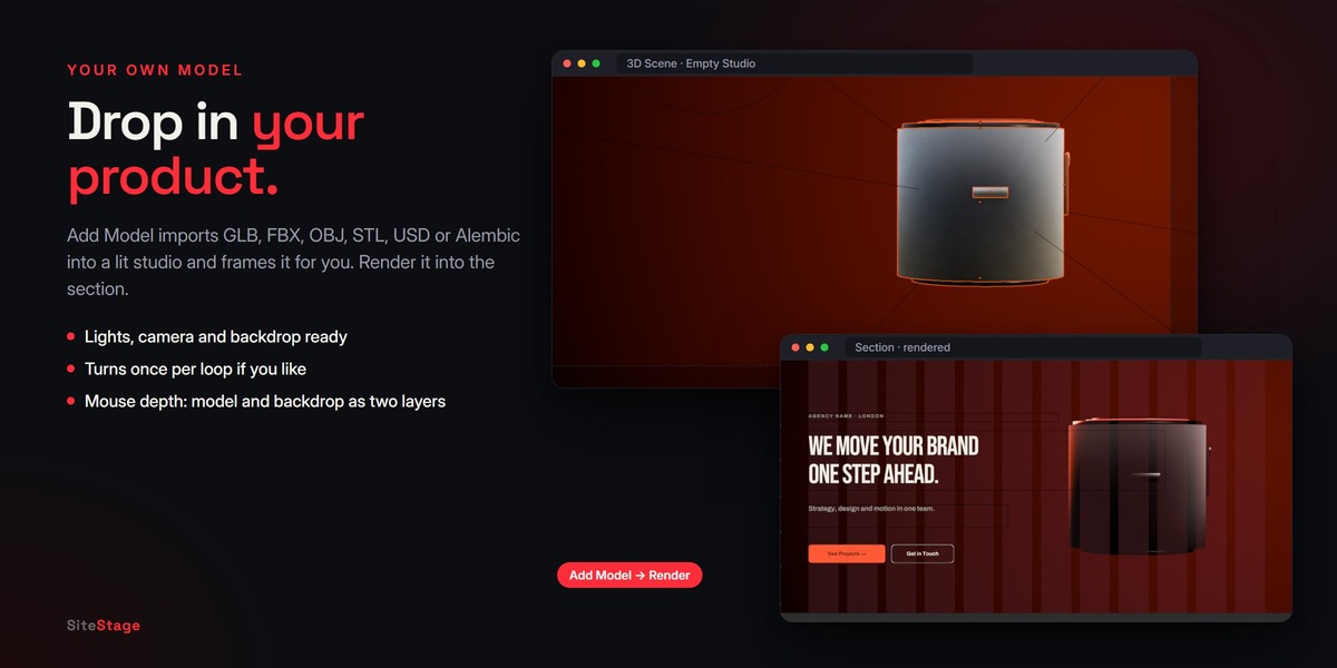
Click Add Model in Section Background to put your own model behind a section. Supported files: GLB, glTF, FBX, OBJ, STL, PLY, USD and Alembic.
- Without a 3D scene, SiteStage creates an Empty Studio with lights, a camera and a backdrop, and frames the model for you.
- In Empty Studio and the Cinematic scenes, the model is placed in the right third of the frame, so your text on the left stays clear. In other scenes, place it yourself in 3D Scene.
- 3D Scene opens the scene: move, scale or replace the model, change its materials, or adjust the lights.
- Turn Model (3D Scene Settings) turns it once per loop in a Looping Video.
- With Mouse Depth on Image, the model and the backdrop become two layers that move with the mouse.
15. Your own Geometry Nodes or your own scene
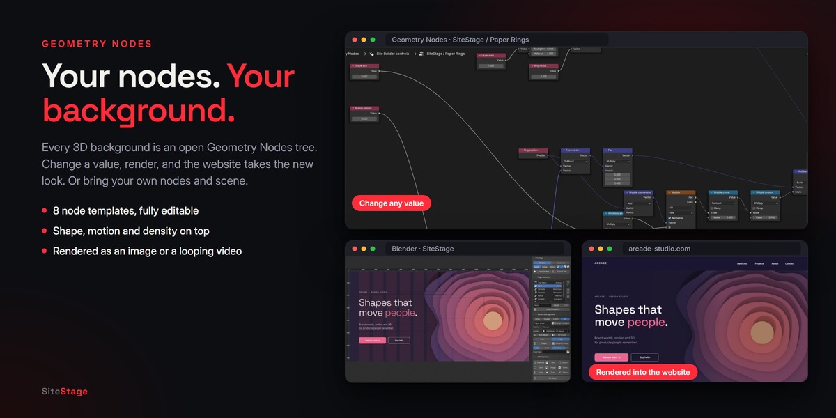
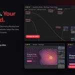
- Every template is a normal Geometry Nodes setup. Click 3D Scene, select the background object and open its node tree in the Geometry Node Editor to change the shapes, colors or motion. The named control nodes (Shape size, Motion amount, Density and others) are the ones the panel sliders drive. If you change them heavily, use your own values and render; Change Template rebuilds the original.
- You can also use any scene of yours as a background. Choose it under Scene in Section Background. It needs a camera. Then click Image or Looping Video. In your own scene you set the camera, lights and render settings yourself.
16. Tablet and phone
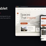
- SiteStage builds the tablet and phone layouts automatically: elements stack in a single column in the order of the layer list.
- Switch to Tablet or Mobile to check them. With an element selected, the Mobile layout box lets you:
- Hide on Mobile
- Set its alignment (Full, Left, Center, Right)
- Set its Width and the Space Above it
- Set its Font Size (0 keeps it automatic)
- The same settings are under Mobile Layout in Selected Element (Advanced).
- The order on phones follows Rulers, Grid and Layers > Elements: use the arrows there.
- Mobile Element Gap (Publish and SEO > Advanced) sets the default space between stacked elements.
On phones, where there is no mouse, mouse depth, follow-the-mouse images and web effects stay calm. A 3D object that travels across sections on desktop plays in its own section on phones; Live 3D works on phones, with AR.
17. Rulers, grid and layers (Advanced)
- Rulers, Columns and Snap buttons.
- Guides: add a vertical or horizontal guide with the buttons, or drag one out of a ruler. Drop a guide on a ruler to delete it.
- Columns, Margin and Gutter set the column grid.
- Elements lists every element in the section, in phone order, with lock and order buttons.
- With several elements selected:
- Align: left, center, right, top, middle, bottom.
- Distribute Horizontally and Distribute Vertically.
- Same Width and Same Height.
18. Live Preview
Live Preview opens the site in your browser and updates about a second after each change. It runs a small local server on your computer (127.0.0.1); nothing is uploaded. Click it again to stop.
19. Export and hosting
Press Export Site. SiteStage writes a folder with:
-
index.html,style.cssandsite.js - Optimized images (WebP)
- Renders and videos
- The fonts the page uses
A window opens: choose where to save the website and type the name of its folder (for example my-site), then click Export Site. SiteStage creates that folder and writes the site into it; next time the same place and name are already filled in. The page itself is always index.html, the file name web hosts look for. After the export the site opens in your browser (turn this off with Open in Browser After Export under Advanced). Publish and SEO > Folder shows the last export folder, and the small folder button next to it opens it.
Upload the whole folder to any static host, for example Netlify, GitHub Pages, Cloudflare Pages or your own server. Exporting again updates the files in the same folder.
20. Publish and SEO
- Heading: the page title shown in the browser tab and search results.
- Description: the short text under the title in search results.
- Language: English, Türkçe or Deutsch. The small texts the site itself shows, such as form labels and the pause button, follow it.
- Icon (favicon) and Share image, shown when people share your link.
- Optimize Images (WebP).
- Folder, Save (.bsb), Open (.bsb), Create New Site and Product Page from a 3D Model.
-
Advanced:
- Open in Browser After Export
- Mobile Element Gap
- Published URL
- Export This Section: one section on its own.
- Copy Embed Code: puts that section into another website.
21. Contact form
Select the Form element and enter a Formspree endpoint under Service, or an email address. Without a service address, the form opens the visitor's email app with a message to your address.
22. Projects
- Save (.bsb) packs the design and every media file it uses into one file, including the rendered views of 3D objects (Mouse, Turn, Scroll, colors), Live 3D models and Glow Orbs, to back it up or move it to another computer. The 3D scenes themselves stay in your .blend file.
- Open (.bsb) opens it in a new scene.
- Open Project (.bsb) is also on the start panel.
- Convert Current Scene to Sections turns an older layout into the section structure.
23. Language of the add-on
The SiteStage interface is in English and Turkish. It follows Blender's language setting (Edit > Preferences > Interface > Translation).
FAQ
Getting started
Do I need to know HTML or CSS? No. You design in Blender and SiteStage writes the code. The exported code is clean and readable if you want to edit it later.
Which Blender versions are supported? Blender 4.2 or newer. SiteStage is tested on 4.2 LTS, 4.5 LTS, 5.1 and 5.2 LTS.
Where is SiteStage after installing? In the 3D Viewport sidebar: press N and click the SiteStage tab.
Is it one page or a whole website? Each design is a one-page website made of sections, with a menu that scrolls to each section. For more pages, make another design and export it to its own folder, then link the pages with Web links.
Design
What is a style? A ready-made look for one kind of business: a color theme, fonts, corners and a moving hero background. Pick one in Create New Site, or apply it later from Theme, Color and Font. Your content stays.
Can I start from a blank page? Yes. Choose Blank Page in Create New Site, then add sections with + or the Ready-Made Section menu.
How do I change a word's color inside a heading? Write it between stars:*word*. It shows in the theme's accent color.
Can I use my own fonts? Yes. In Size and Type Details (Advanced) you can choose any font installed on your computer. Check its license before you use it on a website. The 14 bundled fonts are free for commercial websites.
Can I change the corners, add a border or a gradient? Yes. Select a button, card or picture and click Look (the brush) in its toolbar: corner radius, border thickness and color, gradient with a second color and angle, and opacity. The same settings are in Size and Type Details (Advanced).
Can I use my own colors instead of a theme? Yes. Change the theme colors in Theme, Color and Font (Advanced), or click the brush button on any element to pick its own color.
My heading is hard to read over the background. What can I do? Raise Text Protection in Section Background. It shades only the area behind your text. Or use Darken for the whole section.
3D and backgrounds
Can I use my own 3D model? Yes, in three ways:
- Product Page from a 3D Model builds a whole product page around it in one click.
- 3D Object in Add Element places it anywhere on the page. Under On the Page it can stay still, turn on its own, follow the mouse, play with the scroll or be shown in Live 3D.
Supported files: GLB, glTF, FBX, OBJ, STL (all three ways), and PLY, USD and Alembic for Add Model and File > Import. You can also model directly in the 3D scene.
- Add Model in Section Background puts it behind a section, in a ready studio.
My product is round (a bottle, a speaker). Will the turn show? A perfectly round object looks the same from every side. Use Every Side, which also shows it from above and below, add a Tilt, or give the model a detail such as a label or a handle.
How long does the Product Page take? About one to two minutes on a typical computer: 72 views in three colors, a live 3D model and four close-ups are rendered. Turn off Product Colors for a quicker first version.
Does the scroll motion work on phones? Yes. On desktop the product can travel across sections; on phones it turns in its own section, so it never covers the text.
Can the product change color? Yes. Add colors in Product Colors. Visitors switch them with round buttons under the product, in the renders and in Live 3D.
Can I use my own Geometry Nodes setup? Yes. Open a template with 3D Scene and edit its node tree, or choose any scene of yours that has a camera under Scene in Section Background.
How long does rendering take? A still background usually takes from a few seconds (Fast, EEVEE) to a minute or two (High, Cycles), depending on your computer. A Looping Video and Look at Cursor render many frames, so they take longer.
Image or Looping Video: which should I use? An image is lighter and loads fastest. A looping video adds motion but makes the page heavier. For motion without a video, try the web effects or the interactive patterns.
Why does my animated effect not move in Blender? Web effects and interactive patterns run in the browser. Use Live Preview to see them move.
What happens on phones? Phones have no mouse, so mouse depth, follow-the-mouse images and web effects stay calm. A 3D object with Look at Cursor shows its front view. Visitors who turn on "reduce motion" on their device see still backgrounds too.
Export and publishing
Where are my files? Can I choose the folder? Yes. When you press Export Site, a window asks where to save the website and what to name its folder.
How do I put the site online? Upload the whole exported folder to a static host: Netlify, GitHub Pages, Cloudflare Pages or your own server. Most hosts let you connect your own domain.
I changed my design. How do I update the website? Press Export Site again, then upload the folder again.
Does it need an internet connection? No. The 14 fonts and the icons are bundled. Live Preview runs a local server on your computer (127.0.0.1).
Does the exported site load anything from other servers? Only in four cases:
- A font that is not bundled: it loads from Google Fonts.
- A Video URL you entered.
- A Formspree contact form.
Otherwise everything is in the folder.
- Live 3D: the free model-viewer library loads from Google's servers. The model itself stays in your folder, and Live 3D works even when the page is opened by double-click.
How does the contact form work? Enter a Formspree endpoint under Service to receive messages by email. Or enter your email address: the form then opens the visitor's email app with the message.
Is the site good for search engines? Yes. Set the page Heading, Description, Language and Share image in Publish and SEO. The page uses real text and headings, not images of text.
Can I move my project to another computer? Yes. Save (.bsb) packs the design and every media file into one file. Open (.bsb) opens it.
License
Can I use the result commercially? Yes. The bundled fonts use the SIL Open Font License and the icons use the ISC license; both allow commercial websites. The websites you make are yours.
What is the add-on's license? The add-on code is GPL-3.0-or-later, like Blender itself.
Have questions about this product?
Login to message
| Blender Extension Compatible | Yes |
| Dev Fund Contributor | |
| Published | 8 days ago |
| Blender Version | 4.2 - 5.2 |
| Extension Type | Add-on |
| Render Engine Used | Cycles, Eevee |
| License | GPL |
Discover more products like this
interactive 3d product html portfolio Web Design product page landing page ui 3D background geometry nodes website builder css